
Pantone has been coming up with a “Color of the Year” for 25 years now. It is NOT a commercial marketing gimmick! It is an educational program intended “to engage the design community and color enthusiasts around the world in a conversation around color,” so sayeth Pantone. I am a color enthusiast. I may even own a copy of Colorstrology: What Your Birthday Color Says About You, a book an astrologer put out with Pantone colors for each birthday. It’s fun! But even I am chuckling at the lofty language Pantone is using to describe the impact of their newly-announced selection for 2024, Peach Fuzz. Some more info on how Peach Fuzz is the dose of solace and tranquility the world will need next year:
Pantone, the renowned authority on color and provider of professional color standards, has revealed its highly anticipated Color of the Year for 2024. This annual announcement sets the tone for creative industries, influencing trends in fashion, design, cosmetics, and more.
After meticulous research and analysis, Pantone proudly declared “Peach Fuzz” as the 2024 Color of the Year.
The soft and warm shade of peach embodies freshness, comfort, and a touch of nostalgia. According to Pantone, Peach Fuzz “evokes a sense of tranquility and optimism, reminiscent of sunsets and carefree summer days.”
Leatrice Eiseman, Executive Director of the Pantone Color Institute, emphasizes the significance of this choice. “In seeking a hue that echoes our innate yearning for closeness and connection, we chose a color radiant with warmth and modern elegance. A shade that resonates with compassion, offers a tactile embrace, and effortlessly bridges the youthful with the timeless,” said Eiseman.
The announcement of Peach Fuzz by Pantone has excited designers, artists, and enthusiasts across various industries. It is expected that this delicate hue will find its way into fashion collections, interior design, graphic art, and product development.
Beyond aesthetics, the selection of Peach Fuzz also reflects broader cultural currents. In a fast-paced and complex world, people yearn for moments of tranquility and solace. Pantone acknowledges this collective desire by offering Peach Fuzz as a soothing and comforting presence.
With Peach Fuzz as the 2024 Color of the Year, Pantone encapsulates the sentiments of hope, nostalgia, and calmness. Throughout the year, we can anticipate its influence and integration into diverse creative projects, symbolizing gentle respite in a dynamic world.
I’m sorry, but this selection is really hard to get excited about after the dynamic past two years of Viva Magenta and Very Peri. I am so underwhelmed here. The only Color of the Year I’ve disliked more than Peach Fuzz is 2006’s Sand Dollar. Peach Fuzz is the color of raw chicken breast. Who was on Pantone’s committee this year, Perdue Farms? Is this subliminal messaging to get us to eat more poultry? Color usually makes me happy, but Peach Fuzz is not making me happy. And for those of you wondering why/how Pantone didn’t select the cultural zeitgeist color of the moment, Barbie Pink, well… My best guess is because another company, Rosco, supplied that unique shade for the film. Rosco is Barbie Pink, Pantone is just Peach Fuzz.

Photos credit: xxx/Avalon, Mario Mitsis / BACKGRID, Jonathan Rebboah/Panoramic/Avalon and via Instagram


Barbie Pink is too over already to be the colour of the coming year, so wouldn’t make sense. The peach colour is very lacklustre, I don’t see how it’s going to have a massive impact. And who thought naming it peach ‘fuzz’ was a good idea??
My living room is Benjamin Moore Coral Gables which is a close match to their 2019 Color of the Year Living Coral. I didn’t pick it because of that but I really wanted brightly colored walls.
Every year I look forward to the Pantone color of the year and usually I love it. Peach Fuzz is as bland as you can get while still being an actual color. I am so disappointed in it.
There is nothing cozy or comforting about it. It’s just nothing really.
Totally agree. Color me disappointed as well. I hate bland boring colors.
Yawn. Peach Fuzz? Makes me think of the 1980s, and not in a good way, of poor quality clothes left on the rack at the end of the sale.
Le sigh. I’m a graphic designer so I guess I’ll be seeing this colour soon as clients think they should be using Pantone’s colour of the year. Consider me underwhelmed too?
I’m curious whether graphic designers would consider this peach or kind of maybe nectarine-ish?
It’s got a lot of yellow, skews orangy to me. Difficult to work with?
Yuck. I have a very pink complexion and look terrible in every peach. It does flatter so many darker skin tones, and I generally don’t believe in yucking people’s yums, but what sucks here is that so many things are going to be sold this year in a color I strongly dislike.
I am saying this looking at my Radiant Orchid travel mug which I have loved every day since I got it.
Yep, same here. That’s not going to look good on me, I’m too pale. I do like this color on darker skin tones, just not mine.
Peach is the worst color. I have some ghastly school photos of me in the 1980s wearing a massively oversized cable knit sweater in peach.
I’ve started to reconsider what colors I wear, because what if assumptions made when I was younger were wrong? How have changes to skin and hair color impacted what looks good on me? I’ve looked into the “seasons” stuff, and it’s so confusing. I’ve been told I have neutral undertones, so none of the cool/warm advice seems to apply to me. If anyone knows a good resource for this kind of thing, please let me know!
Instead of Sad Beige we now have Sad Peach.
My 11 year-old daughter and I recently walked through the shoe department at Macy’s and said “hi Barbie!” to every single shoe that was Barbie pink, which was A LOT. So cheerful, so happy. This is…so 80’s, so dreadful. This is the color of the dress I wore to my first homecoming dance in 1991. This is not a good color. And anything “fuzz” no thank you.
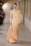
Those Pantone color chips don’t look pleasing at all to me but I love the color of Malala’s outfit pictured above, the very paleness of it. Pantone’s color chip looks very Boca Raton in the 1980s.
I bought some light apricot throw pillows a couple of months ago, so I’m going to consider myself on-trend, haha. I don’t actually mind this color selection, it makes me feel calm, and I do love peaches.