
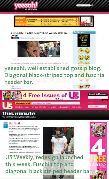
I’ve been a web designer for nearly 10 years. (Yes, I’m older than 30 but not much.) When I saw the new redesign at the US Weekly website, I thought “Holy crap the designer used yeeeah! for inspiration and sure didn’t change much.,” Yeeeah’s signature look is unmistakable. It looks like US Weekly’s designer used the same core design elements: fuschia accent color and diagonal black-striped bar, and just reversed the header so it wouldn’t be too much of a copy. It’s way too close for coincidence.
Someone at Us Weekly needs to have a serious discussion with their design team. It’s possible that an executive or marketing person said “You know, we really like this yeeeah! site, can you do something like this for us?” You think they could come up with a unique design or pick a site to copy that’s not in the same realm so the ripoff is harder to spot.


On the plus side, the Yeeeah site still looks a hell of a lot better.
Coincidence. People really need to get a life.
you’ve been a designer for 10 years and this is the best you can do? sorry, but its not worth bragging about something unless you can show you have the chops to back it up.
Yeah it looks kinda similar, but in the end does it really matter?
Well, both sites are using a modification of the ‘K2’ theme for WordPress. ‘Yeeah!’ is using WordPress, and the ‘US’ site is using the Drupal engine with a port of the ‘K2’ theme, so I guess the ‘K2’ designers deserve some credit as well.
Kelly Brett, your IP Address says you’re from Dennis Publishing, which owns US Weekly – meaning you work there.
Jorge I hear what you’re saying about the quick post, and I could have gone into more details. There are other very similar design elements in the site that strike me as more than just coincidence, but I just did a quick article about it.
K2 is just a two-column design using a header.
The fact remains that the same design treatments and colors were used by US Weekly, and the result is highly suspect.
Yeeah’s shade of pink’s hue: 341
Us Weekly’s hade of pink’s hue: 340
Yeah’s shade of blue hue: 199
Us Weekly’s ahde of blue hue: 195
Angle of the stripes on both: 45 degrees
Seems like the work of a lazy production asst./jr. designer to me.