

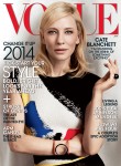
As I previewed yesterday, Cate Blanchett covers the new issue of Vogue Mag, the January issue. I saw some sites complaining about how “boring” it was for Vogue to give Cate her FIFTH cover, but I like that she’s gotten another one. She’s had a good year and she’s definitely going to get an Oscar nomination for Blue Jasmine, so this cover makes sense. Plus, she’s promoting her supporting role in The Monuments Men, with her buddy George Clooney.
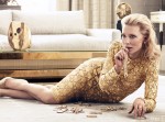
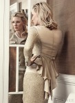
Now, all that being said, I’ve been looking at these Craig McDean photos for a while and… I’m not really feeling this editorial. Cate is flawless – she looks good in nearly anything, she’s aging beautifully and she’s just an awesome person. She’s also one of the most photogenic women in the world. So… is it just me or is this photoshoot really blah? It’s like they were trying to challenge themselves with “Let’s see how boring we can make her look and see if she still pops!” Or maybe I’m overthinking it. Or maybe Vogue needed to think more about it.
You can read the cover story preview here – all I’m getting is that Cate is not good with math or time and that her go-to name of affection is not “honey” or “sweetie” but “Ace”. LOVE IT.
One more thing – Cate is still supposed to do John Hillcoat’s new film, Triple Nine, only the dude actors in the film have changed up. It’s possible that Cate’s next film will star… Christoph Waltz (!), Chiwetel Ejiofor (!!), Michael B. Jordan (!!!) and Casey Affleck. That sounds super-interesting. Chiwetel and Cate? I want to go there.


Photos courtesy of Craig McDean/VOGUE.


I dunno … I like the pictures. And I saw her in a play a few years ago. She’s actually more beautiful in person than she is in pictures. SO not fair!
Cover would have been better without the PhotoShopping of her face! Too much.
Ugh.
I think she looks quite good in these. The cover is very bland though.
It looks like they TRIED to but this is Cate Blanchett so it’s not technically possible lol, the shoot really is nothing special but I still quite like it.
I think they did the best they could? She’s not an attractive lady.
“she’s not an attractive lady”
I disagree with that statement SO much lol, I can’t even explain how much I disagree.
I agree. The spreads are very warm white and beige-y. Kinda blah. Makes me want to yawn….
Overall, I think too many covers and professional photos are now photoshopped to death. Somehow, in the pursuit of perfection and ‘art’, they robbed us of our humanity and are actually less interesting as a result. Whodya thunk it?!?
Anna Wintour gets nervous around anyone who looks happy.
“No, no… Make her dead in the eyes….so everyone will know she is one of us.”
Yeah…my thought was she looks rather brain dead. Still gorgeous, though.
anna wintour freaks me out
Bland and monotone, and awkward poses, which is sooo not Cate. Bad all around.
+1, beige beige beige. Also, she looks to be in pain against the window, rather than sultry. Were they going for the kidney stones look?
Kiddo, that look is all the rage! Didn’t you know???
Photographer: Yes, look as if you’re concentrating so hard that it pains you… No harder. Think childbirth, or passing a kidney or gallbladder stone… there, there, THERE! Excellent! I could actually *imagine* you passing a stone. Tres chic!
ETA: She looks in pain against the wall too….
LMAO. Bad editing, bad styling and bad direction.
Yup, it looks as if she is selling window treatments. Bleh.
I agree. The photos are distinctly blah. Especially the cover photo and the last one. I mean, you’ve got one of the most photogenic women in the world, and you think it would be a great idea to put her lying on the floor biting on some jewellery? Come ON!
Anna Wintour isn’t someone I’d want to hang out with for sure. I doubt she’s funny.
cuz her toes are pinched in those dreadful shoes she wears!
They aren’t terribly exciting photos, but I don’t think it’s possible to make Cate look bland. Something about her just commands your eye’s attention.
Yeah, her stare is quite something. It makes her really striking and comanding in every photo.
It’s US Vogue. It’s always bland.
I think she’s stunning, but beige is not great on her. It makes her look beige. Beautiful, but beige.
Also, there’s such a disconnect between the cover shot and the editorial. It doesn’t make sense.
Dahling, how many people DO look good in that dreadful colour????
*flutters*
Oh, dahling, DO forgive me! I forgot about your distressing beige phobia. Shall I call Dr. Z for you? Or send over a pick me up? Xanax? What dahling, do let me make it up to you…
She looks beautiful as always but there’s just too much beige.
Exactly. The ‘canvas’ is already beige, so there needs to be some contrast, and that nude lipstick does nothing for her. She needs some color — any color!
Meh. This retro-ish “billionaire’s bored wife” look does nothing for me. She has such a lovely and interesting personality, I think it’s a shame they’ve wasted it on this tired layout. And the way they’ve done the colors washes her out. I think they’re going for that pale blonde on gold palette but it’s just not working because they’ve done nothing to lift her face/form from the scenery. Also, they’ve used too much of that slightly open mouth pose. Even on someone like Cate, it’s quite irritating.
I wonder if they were trying to do something inspired by Blue Jasmine.
That cover is weak, Cate doesn’t need all that photoshop.
Wow…look at all that photoshop. I agree with the bland billionaire, beige stuff…Yikes, not at all neccessary. Marvelous actress, though. So, yeah, wonderful actress, but waaaay too much PS.
I know everyone LOVES her, but I just find her so bland. She reminds me of Jessica Biel, who is physically pretty, yet so dull that it kind of hampers it. I’m sure I’m the only one though!
I don’t think she could look bland if she wore a bag. I’ve heard from other’s that she is so much prettier in person too and that her complexion is so smooth and even that it almost looks like she has make up on when she doesn’t. Lucky lady!
Yeeouch! The “biting jewelry” photo is awful. Very mutton. Do not have this distinguished actor posing like a coquette! It’s all wrong.
She does look stunningly beautiful (when she does not?) in all the photos, but something about the colors is off to me. I actually like the cover a lot, but the photo spread somehow does not relate with it. It lacks the freshness of the cover and kind of remind me of her character Jasmine (or Jeanette) in Blue Jasmine. So she is styled like the trophy billionaire wife who is bored with her life, but maybe that was what they want to achieve (though is is boring).
oooh i love her dress
MMMmmmm, I too love eating watches in my spare time…… seriously though, she looks good but somebody needs to fire Anna Wintour! Homegirl has seen her sell by date, and she is bringing this once awesome publication down HARD!
I knew this was for US Vogue by the excess photoshopping and bland-ness.
Because Vogue likes bland women, even if Cate is not one.