
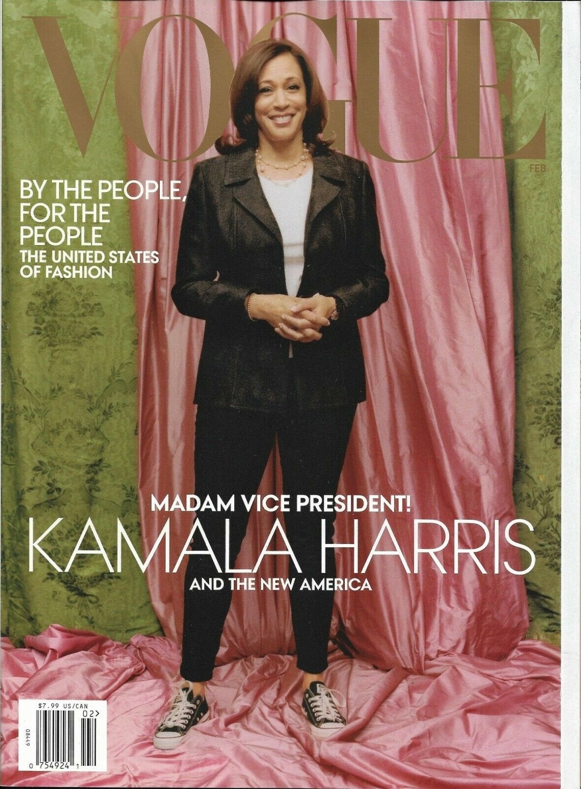
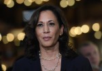
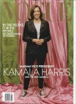
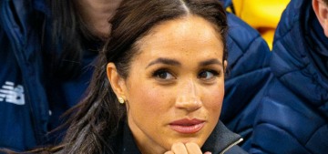
Anna Wintour is a big Democratic Party donor and fundraiser, and she’s a perennial favorite on Democratic presidents’ permanent list for ambassadorships (especially to the UK or France). She often uses her position of Vogue’s Editor In Chief to raise the profile of political women (and some men). I remember during the depressing Bush era, Vogue did a few profiles of Condi Rice and that was about it. It paled in comparison to the coverage Vogue gave the Obamas. My guess is that Anna approached the Bidens and the Harris-Emhoffs and asked who should get a cover profile, Dr. Jill Biden or VP Kamala Harris. Kamala won out. The problem? This cover… isn’t good. It looks really half-assed from a photographic and editorial standpoint. The weirdness around her head is strange too, like some Photoshop gone wrong, like maybe this wasn’t really the original backdrop. According to Yashar Ali, there’s a lot of drama:
1. The February Vogue cover featuring VP-elect Kamala Harris has been widely criticized on social media this evening. But according to a source familiar with the publication plans, this is not the cover that the Vice President-elect’s team expected.
2. In the cover that they expected, Vice President-elect Harris was wearing a powder blue suit. That was the cover that the Vice President-elect’s team and the Vogue team, including Anna Wintour, mutually agreed upon…which is standard for fashion magazines.
3. To be clear, this Vogue cover of Vice President-elect Kamala Harris is real. It’s just that per a source familiar, this is not the cover that was mutually agreed upon. The agreed upon cover had VP-elect Harris in a powder blue suit. So folks feel blindsided this evening.
It’s possible Anna thought this shot, with the Chucks and the lowkey backdrop, was “cooler” or more youthful and simply a better shot. But it’s extremely bad form if Vogue and the VP’s office had already signed off another shot, one in which (presumably) the incoming Vice President looked more dignified and powerful. There’s been a lot of talk about how we shouldn’t expect VP Harris or Dr. Jill to come in and be fashionistas, that they’re probably going to be pretty boring, fashion-wise, and how that’s totally fine. But I feel like Vogue and VP Harris could have had a really great relationship, and Vogue’s staff (and Wintour) could have helped Kamala discover her own VP Look with power suits and power pumps and such. But Wintour might have damaged that relationship from the word go.
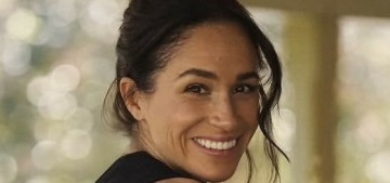
Update: Vogue just released their two February covers – one of Kamala looking (vice) presidential, and the other one.
Vice President-elect @KamalaHarris is our February cover star!
Making history was the first step. Now Harris has an even more monumental task: to help heal a fractured America—and lead it out of crisis. Read the full profile: https://t.co/W5BQPTH7AU pic.twitter.com/OCFvVqTlOk
— Vogue Magazine (@voguemagazine) January 10, 2021
Photos courtesy of Avalon Red, Backgrid.


MVP Harris on the cover head to toe, in a designer suit, in this economy and pandemic would have been side eyed by a ton of supporters.
In a year or two time, the glam cover will come.
I agree with you, but the non glam outfit aside I dont think this is a great photo.
The photo itself is a mess and not flattering from any interpretation imo.
Just a bad photo.
If this is the best Anna can do at this point, it’s an issue.
That’s true. But I still don’t get that pink mess in the background.
She’s a member of AKA, a historically black sorority. The background is their colors.
The VP is in a black sorority that she joined in college called Alpha Kappa Alpha or AKA. Their colors are pink and green. The sorority focuses on community service and uplifting those in need. She is still active with the sorority and it is a big part of who she is.
I think people get the colors, or the colors aren’t what’s being criticized so much as the material that was chosen and the way it’s all arranged.
And I really, truly hope this is just one of many covers they tested and they’re not going with it. The excerpted quotes don’t make it entirely clear. When I read it the first time I thought they were saying this IS one of the covers Vogue tested, as in it’s not a photoshopped fake from some corner of the internet, but not the one they all decided to go with. And then the hullabaloo would be about who leaked this unflattering, silly looking cover and why?
But reading it again it could also be interpreted as this is the actual Feb cover that Vogue has chosen, against VP Harris’s wishes, even though VP Harris and Vogue originally decided on a different one.
Is Vogue one of the magazines that has different covers for the mags that go out to subscribers and the ones that go out to the stores? Or do they ever do like 4 different covers so you can “collect them all”?
Vogue needs to stop hiring nepotism editors, stylists and photographers to avoid these awful photos. No respectable photographer should ever have sent this sloppy mess in for approval.
You have baroque in the background and city wear(which looks like she arrived in her own clothing before campaigning door to door) from Kamala, with some terrible lighting and photoshop. Is this VOGUE or is it a college newspaper? No one would have said Hillary in a power suit was too glam. We wouldn’t even have said that of Michelle. Why is that an excuse for sloppy work here?
The pink is the problem IMO. It manages to wash Kamala out and give her skin a sallow look.
Exactly which “supporters” would be upset with Kamala having a glam cover?
Of a magazine that we know makes their covers in advance of what is happening currently.
Agreed. That comment about her not being able to wear a designer suit during the pandemic is ridiculous and sexist. Does anyone ever bother to investigate the prices of the suits of the male VPs? I’m sure they’re not cheap…
@OriginalLeigh All of this! Let’s find out how much their haircuts, facial trims & shoe polishing costs as well. The double standard for women in politics when it comes to fashion & cost (like it’s their pin money & our business) is nuts.
A powder blue suit is ‘glam’?
A powder blue suit like the one she is wearing is workwear for her. I’m confused about why the Vogue people would have rejected that one.
The converse have actually been an important symbol in Harris’s campaign & image, so I understand why they wanted them on the cover. She has talked about having numerous pairs (I want the black leather ones).
There’s a good article from The Guardian about their significance on numerous fronts: “Semmelhack believes Harris’s shoes signal action. “The sneakers are acting as the sartorial equivalent of being willing to roll up her sleeves,” she says. They suggest Harris “is a woman of action”.”
It looks like a test shot. Not problem with the Chucks, but the sheets in the back are wrinkled and she has a weird look on her face. And not a VPish type suit. I don’t expect glitter but more than off the street suit and tshirt. That look could have been in the article.
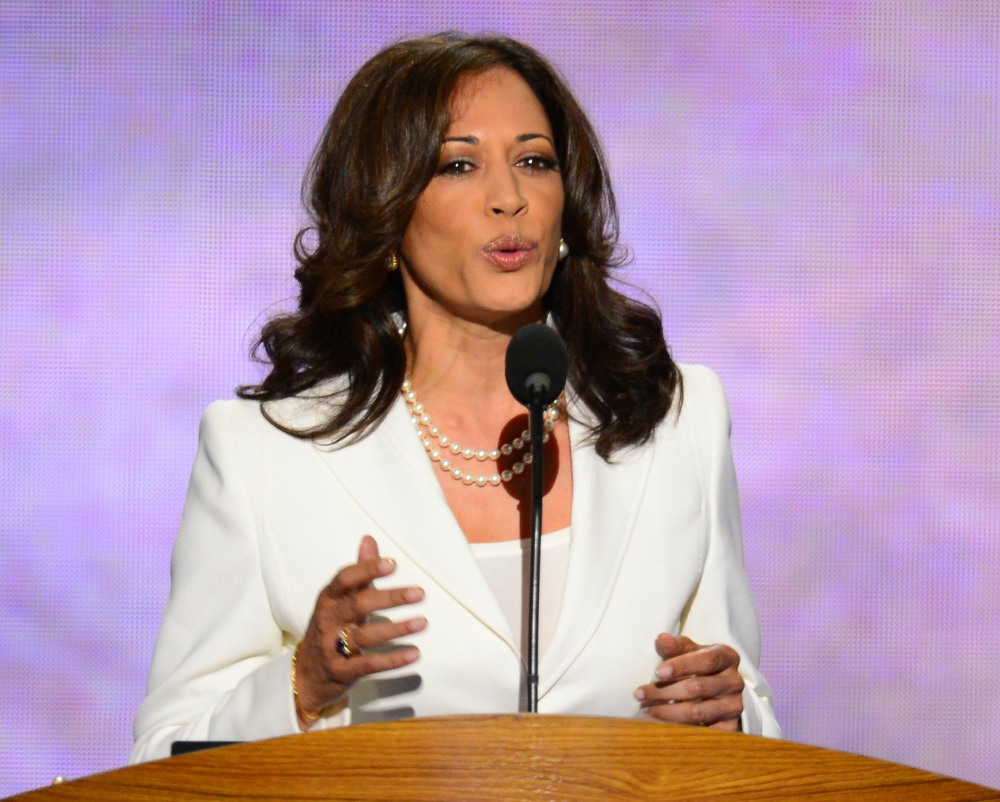
What a weird cover, it looks like a trial shot to see what the light is like. The pink curtain just looks like a dust sheet, even the expression on her face is like 🤔. How bizarre. That photo of her in the white suit looks 100 times better and it’s a candid. Shes so beautiful and powerful looking, how odd that they used this outtake.
Right? I was just strolling down and saw her in the white suit and that pic is 100 times better.
Exactly what I thought. The pink one was set up, they had a few different backdrops prepared, then Kamala rushed in straight after work in her dark suit. The photographer asked her to stand there just while they checked lighting or something. That’s the only way I could see this pink one happening. To me, the whole premise is pretty….non-creative? Disappointing, I think. Kamala’s team sounded disappointed. And it exhibits a curious lack of judgement on the part of whoever signed off on it.
I am baffled, how that pink mess got green lit is a mystery we may never know.
She looks better styled in the shots from election night. WTF? I personally love when she wears her Chucks but this cover doesn’t capture her beauty and energy nearly as well as I would expect a premier fashion magazine would.
This looks like a cheap prom night backdrop,like someone asked her to stand there as they were testing the light.
Yes, and her smile is saying “hurry up and get this over with,” not her usual genuine smile that reaches to her eyes.
Horrible and unflattering.
So weird how poor quality this looks. She looks cut and pasted into the backdrop. I love her look but Vogue could have done better. Also, hope Melania is jealous AF.
👍🏻
Maybe this cover leaked just to get people talking for publicity and the real cover will be the one with VP Harris in the blue suit.
Exactly what I was thinking. It’s all for the PR.
I just checked to find out who owns Vogue. Conde Nast owns it. They got a new Global CEO in April 2019–Roger Lynch. A Conde Nast assistant (Black) quit after he gave her a Strunk & White as a gift. Good for her. Do you think this might be the start of smears toward VP-Elect Harris?
In her best moments VP Harris has an impish look that conveys “ I got this!” and I believe that’s captured in this photo. I’m not crazy about the back drop ( seems thrown together)
but her personality shines thru…
In the future Anna better get her ps and q’s aligned cause when Harris is in the room SHES the boss!
I’m fine with the outfit and backdrop being pink for her sorority ties but I agree that it’s just not a well done photo. Something about the arrangement is off? I think she herself looks good though. I’ve seen much better photos of her and this one should be better, but it’s not bad.
After what has happened this week, THIS is really such a comical story. REALLY??? She looks great, who cares, good for her and yeah, I too hope Melania and her husband are jealous about his too. Hahahahhaa.
The background is yuck. And the editing looks weird. But otherwise, I’m okay with it.
I’m not entirely sure it’s real though. That barcode on the pic look weird to me.
I hope so much this is not the real cover. This is not good. At all. The backdrop is awful and this shot doesn’t capture her strength, the lighting is poor, and the styling is lacking.
Oooof. Hopefully they see the blowback and make a swap if it’s not too late.
Was just in B&N – there’s actually two covers for the January 2021 issue. One is Frances McDormand, the other is Naomi Osaka. Both of which are better than either of these IMO. So it’s possible they were planning on both covers of Harris going out. I really hope they pull that first one, especially if her team didn’t sign off on it.
I think it would’ve been neat to see her sitting casually at a desk, even if not her personal one (though one that has real work papers on it, not the Kate version) with her sharp black jacket and Chuck Taylor’s. Plenty of other ways to incorporate her connection to her sorority.
I guess they’re doing pink and green because she’s an AKA, but this frankly looks terrible and thrown together.
VPHarris looks much better styled and put together at regular appearances than she does on this Vogue cover. I’ve commented to friends more than once about how hair always looks shampoo-commercial gorgeous, and here is just looks blah. The outfit might have worked, but it’s totally wrong for that background–if they’re going to cut and paste her into another shot, as this so looks like they did, they could have put her somewhere better.
Sneakers, yes. Puddle of pink fabric, no.
1. I’m so happy they won and she’s on the cover – so it’s hard for me to get mad. 2. I’m glad it leaked early just to Ef w/ Trump. 3. I love the AKA colors, it’s awesome they are honoring her HBCU roots. However- the draping is sloppy, which is odd.
It’s hard for me to get mad about this because of above reasons 💚💗💚
It’s not the best photo, but I too love that they incorporated her HBCU/black sorority background with the pink and green. It could have been done better, but this is a big step.
It’s Vogue & this was the best they could do?
There is no way that is the real cover – its too amateur for Vogue esp American Vogue.
Not only is it badly lit – it bad photoshop, looks to me like the office intern used some photo’s that there lifted off Google images.
I’m done giving Anna the benefit of the doubt. Condé Nast just gave her a big promotion, and this is what she delivered. She was more considerate of Kanye and Kim’s Vogue covers…Melania’s was even better than this! She approved a cover shot that makes Kamala look like she’s on a package for a McCall’s pattern from the early 90s. Kamala still looks beautiful, but everything about the styling, staging, and lighting is absolute garbage. She looked 1000 times better when she was photographed stepping off the plane in her Chucks.
LOL on the McCall’s pattern! Looks like this was done by an intern only halfway through an online course on “How to Pose Your Subject”. Among other things, the huge white headline with her name pulls the eye to the bottom third of the page, so the immediate impact is feet and weird bunched up fabric. By contrast, her face, which should be the most important element, is lost at the top with the dark gold lettering behind.
They could have given her a pink and green scarf; having that near her face would have emphasized the importance of her sorority connection 100% better.
Agree with everything you said (I laughed out loud at the intern comment!), especially with the half-assed tribute to her sorority colors, because she really has expressed a lot of pride in being an AKA, and they’ve shown up for her in turn.
I’m not overly impressed with the second cover either. Overall, IMO also not especially creative. I think something about the warm yellow background vs the cool blue of the suit bugs me. But, at least the balance is much better, her face pops out at you, and she looks completely professional and (Vice) Presidential.
There’s so many cool things that could have been done with the first one, it really is a pity.
McCall’s pattern! I choked. 😂
Kamala Harris already have a cover, Trump and other conservatives are about to seethe and I love to see it lol.
Yes, my dark, petty heart feels the same!
What bugs me about this photo is the mix between the plain, rather unflattering pantsuit, the sneakers and the fancy drapes/wallpaper it just doesn’t work imho. Either keep the pantsuit and the sneakers (I love that she’s wearing them) and change the background or keep the background and change the clothes.
+1
Anna Wintour as an ambassador? No, ew, no.
This seems intentionally bad. Anna is on some BS
I don’t like the background, but love VP-elect Harris wearing a suit with Chucks!
Agreed on the Chucks! I honestly think it’s the worst picture that I have ever seen of this stunningly beautiful woman who projects her confidence and competence with ease.
Phuckk you vogue they’re super cancelled now as they have been w me anyway
i like the picture. it’s simple. the VP elect is in her work suit with the fitted pants, vs the looser fit Hillary wore. wearing her chucks and sorority colors. this is her, everyday. in a pandemic i don’t want to see her first cover wearing a ball gown. that’s tone deaf.
maybe i don’t understand the problem with it.
This is a shame. I love her in Chucks and black leather. But if you’re going to go that way, it’s not done with taffetas, silks, damask and brocade type designs for for both dress and wall going back a few hundred years. This woman deserved a progressive cover to match her Chucks. Her leather. Her personality. Her path and her future. This is just confusion. That’s a backdrop for the Fanning sisters.
This. It’s lacking cohesion in vision, and the juxtaposition of glam and ‘everyday’ isn’t done well enough for that to be a focus.
She looks like she wandered onto a Bridgerton set piece.
Vogue has the chance to show the first female, first woman of colour, Vice President and I hope to all hell this isn’t the best Wintour came up with.
They’re generating buzz with this. Classic leak. Don’t worry. This isn’t the cover and it was never going to be the cover.
Why does she even need help discovering her look? Or “power pumps”? She always looks great. The comfortable shoes are cool, and a breath of fresh air.
The background is just arranged a bit sloppily and looks like a high school art studio or drama classroom. I don’t like the jacket that much, and she looks slightly uncomfortable which is strange because she usually looks so confident and comfortable in other shots.
US Vogue continues to be the worst. The international covers are always so much better. This is a mess!
100%. If you want a feast for the eyes, follow Vogue Arabia on Instagram
So agree! As an American I find it to be the most boring Vogue. Anna and her whole team need to go before I start paying attention to and paying for American Vogue.
Given Wintour’s and Vogue’s awful record on race (as most recently exposed in a NYT piece) and just their awfulness in general (remember the puff piece on the Assads ?) no public figure should be working with Vogue. There are other fashion magazines out there (Elle has far more compelling long form pieces). And Kamala Harris doesn’t need Vogue to develop her style.
Also is Yashar Ali’s Twitter a reliable source? He’s a bit sensationalistic.
The backdrops are odd in both. Are they maybe supposed to allude to sari fabric?
I don’t like these pictures.
Well, maybe she’ll do this again some time and they’ll do a better job of capturing her energy and spark. She’s so pretty anyway, so it’s impossible to make her look ugly, and maybe next time they’ll showcase her better.
That first photo is just a bad photo. She could have been in a more casual look and it be styled way better. The powder blue suit photo is much better and it’s notable that it’s the photo Kamala and her people wanted.
Who took the photos, is Annie Lebowitz involved because she seems to have a bad track record for any non white subjects.
There’s a pandemic on. Nobody, not even Annie Lebowitz, was allowed in the room with her.
That’s silly. If there were any personal stylists (hair, makeup) for the shoot, they would’ve been much closer to her than a photographer would have been. In any event, that first cover is a full body shot. The photographer would easily have been more than six feet away from her (and masked).
Photographer was Tyler Mitchell, who did the Vogue Beyoncé cover. Young Black man, super talented and has lots of beautiful, beautiful work in his portfolio. I loved the Beyoncé cover! These two (including the powder blue suit) are weirdly boring / bad. I vividly remember Hillary and Michelle and Huma in Vogue… they looked phenomenal.
She looks good and ready to start her job.
There is a pandemic and people are dying at a rate of 4000 a day in the U.S. I doubt very much that a professional photographer was allowed anywhere near the future V.P. This looks amateurish because it was probably taken by an amateur. Or else it was done remotely.
They had photographers with them during the campaign. Any of them would have done a better job than that first photo. This is the function of bad styling and design and then weird editing. It’s not Doug with an iPhone although he would have been better.
Biden has an official, professional photographer, as Obama had Pete Souza. It may or may not be the same one that served as his campaign photographer, but he’s definitely got someone recording everything for posterity, and I’m sure Harris does as well.
The photography is the least of the problems with that first cover.
https://www.dpreview.com/interviews/2622047235/interview-joe-biden-s-official-photographer-adam-schultz
This looks like when you enter a museum special exhibit sometimes and they take a photo of you when you enter just to ask you to pay for your copy when you exit. I just can’t figure out what the exhibit here would be. Interior Design of Brothels? Satin Curtains Through the Ages? Winchester Mystery House on Acid?
I know, she’s really a beautiful woman, and to honor your sorority by standing in front of their colors- is so awesome. Can’t wait until she’s President!
I love the covers! They’re very on-brand for Kamala, very “I’m getting shit done”. As much as I adored seeing Michelle Obama in all her elegance, I understand that some would say that it’s not appropriate to do the same sort of cover for the first woman Vice President (and hopefully POTUS in 2024!) as you would for a First Lady (no disrespect to Michelle, obviously! She’s an intelligent, badass woman who can hold her own in life, but just happened to catch herself a damn good man. Also, best side-eye in American history).
That said, I’d love to see a glam Kamala cover in the future. She’s beautiful and could definitely pull it off. And bring on the Dr. Jill features, too! Hell, maybe do a salute to all women doctors outside the medical profession, just to troll whiny-ass, sub-mediocre, threatened, misogynistic white men like Tucker Carlson (hey, they spent the past 4 years basing all their opinions and policies on “owning the libs”. We shouldn’t waste our time like that, but I think we deserve at least a few “owning the cons” moments).
It makes sense now that those are two covers, one of her looking very vice-presidential, then one in her normal clothes and shoes with her sorority colors.
I don’t see what the problem is with the covers. She looks good, she looks in charge. That’s what we need.
We are in the middle of a pandemic, people have lost their jobs and the Trump minions just tried to overthrow the government. Dressing her in fancy couture would have just been tacky and tasteless.
I’m just waiting for the reaction from my mom, she’s silent generation and was raised Tory. She’s one of those fiscally conservative but socially liberal to a point people. She doesn’t believe in women having too much power regardless of how men have made a mess of it since the beginning of time. She loves Vogue so this will be interesting.
If you don’t see it we can’t explain it. It’s a matter of TASTE.
AESTHETICS.
That cover is truly awful, and it’s shady as hell to switch the photo after a another photo was already agreed upon. This is standard to set terms of a cover and they wouldn’t have done this with a reality star, so to do this to the incoming VP, especially with what we are currently going through is incredibly disrespectful and undermining. If they wanted a sneaker/ suit look, they should have used a still from the campaign trail. A lot of photographers are just picking it apart on aesthetic grounds, the poor composition and lighting. Was Brooklyn Beckham the photographer? Seriously though, did they even consult the photographer before they published because it may have been a throwaway test shot, and hope they didn’t think this was meant to be on the cover. I can’t stand Wintour and think she is the queen of racial micro aggressions. The worst part is that it relegates the Vice-President getting involved in a fashion fight and sexist stereotypes, of not taking women politicians seriously. We don’t need anything to undermine our newly elected administration, and this little issue does. Shame on the Vogue team and Wintour. They should pulp that cover.
Is she wearing Chucks with the blue suit? I would have liked to see that pairing.
My impression — before I read about the pink and green being her AKA colours — was Vogue trying to contrast this fancy background with how casual/cool Kamala is.
I would have liked to see the close up of her in the blue suit with the pink background. Or just a better shot of her posing with the pink background. Her expression looks candid, like a tear shot. She’s not framed well.
I like both covers. Loved her in Chucks.
Meena Harris, Kamala’s niece, tweeted that she can’t even talk about that cover after the week we’ve had, lol.
Also, word is that Harris’ team didn’t even approve that photo as an option. So they probably signed off on a few photos, but that one wasn’t part of it. This is really effed up.
This photo is a mess. It is so bad as to be easily perceived as an intentional micro aggression. No one would look their best planted in front of pepto colored curtains against a 1970’s green wall. This is just not great. The photo she actually approved is amazing.
This “drama” is so rude. The background is made up of her sorority colors and she is proud of them; I love either cover. She looks like she really enjoyed her time, and that is absolutely all that matters. One is approachable and one is all business. A perfect balance. I am ecstatic for her vogue profile!
The angle, the lighting and the sad, messy pink satin are the primary problems. That said, I love her in both the powder blue and ivory suits. Also, on the cover in question, the jack is short and of a boxy cut. Not great on anyone under 5’10, from my 5’5.5 perspective,
Loved both covers: the first was typically vice presidential, the other celebrated a woman in action proud of her sorority roots. But it was incredibly rude to have a mutual agreement in on what would be the print cover only to switch it out to something not agreed upon. Even the photographer only posted the blue suit gold background version so he didn’t even know that Wintour had done the switch. Disrespectful to a great woman who has broken so many barriers and the photographer a young black man who should both be celebrating a Vogue win.
I get wanting to do a more casual photo… but they couldn’t find a shot of her with a more flattering facial expression??? The photo is a mess!
Too bad they can’t use the photo of her in the white clothes at the lectern. THAT is a look!
Like everyone else said, the pink and green one looks like a test shot. I posed for a few of those myself to help a photographer friend get set up to photograph our office and staff for some brochures. I was stood awkwardly like that and had the same goofy uncomfortable expression.
The lighting is poor and the angles are bad. It’s an awful photo. The background and clothes and even the pose could still work, but they needed to fix the lighting and angles and tweak the exposure so she doesn’t look washed out. And for goodness sake snap until you get a decent smile. My mom smiles like that when my dad tells an awful dad joke. It all makes Vogue look bad if that’s the actual final cover they chose.
I like both covers! But it’s possible the one that was leaked is a digital cover, not the print cover.
Might it be time for a change at Vogue. This cover, the Frances McDormand cover, the unflattering Simone Biles cover – the empress has no clothes.
I really like the cover with her in the blue suit. She looks gorgeous in both, but the one with the pink and green wrinkled tablecloth is just weird, and doesn’t look like a “cover.”
We should realize that even if Kamala was lounging in a tub with champagne and strawberries, she looks Vice Presidential. She does not have to be perfectly coifed and groomed to look “right”. She is VP and allowed to be human. We need to stop with the ideas that woman have to “look right” to be respected. Supposedly the colors of the “messy” picture were associated with her sorority.
I can see why they preferred the blue suit – better focus on her face, the color contrast works better, her stance is more stern and professional, and it’s all around more flattering. Really curious what went down there to make that decision change.
I just think the first picture isn’t a good picture of her, I like that they showed the chucks… but it’s not a great shot.
I mean, she’s gorgeous.
Both photos are by an amazing photographer named Tyler Mitchell. He’s the one who photographed Beyoncé for the cover of Vogue, the first black photographer to shoot a cover for the magazine.
His work tends to include a lot of brighter pastel colors, and intentional display of fabric or the edges of backdrops in the background. It’s a creative choice, and not one from lack of skill.
There’s a lot of acticles where he talks about his use of brighter colors as a way of creating an image of “what a black utopia looks or could look like,” a visual space full of black joy.
I really like his work and it’s a bummer that the knee jerk reaction to these covers.
And I’m his visual style is very clear. Vogue knew what they were getting when they hired him, so none of the results should be a surprise.