
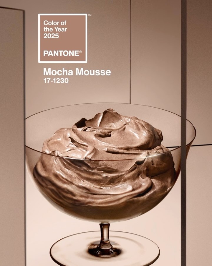
My excitement for what 2025 has in store melted away like sun tan in the rain when America elected to send a convicted felon and adjudicated rapist back to the White House. Call me partisan. But I still had one last bit of enthusiasm reserved, and of course it was for the Pantone 2025 Color of the Year. I’ve been waiting a year for this reveal, thanks to how utterly disappointed I was with the selection for 2024: Peach Fuzz. I was as underwhelmed and undercooked about Peach Fuzz as the raw chicken breast hue it resembled. Well, friends, the wait is finally over! And what dazzling shade has Pantone come up with to redeem themselves from last year’s fail? Mocha Mousse! Is it the electric shock of color I was looking for? Nope! But is it better than sad peach? You betcha! Please enjoy some effusive, decadent language from Pantone on how Mocha Mousse is the sanctuary of harmony the world has been craving:
Color us shocked. Pantone’s shade of the year has been announced and it’s… brown?
That’s right: Brat Summer’s neon green and “Wicked’s” watermelon-chic aesthetic are so 2024, with the color company announcing Thursday morning that the shade for 2025 is a more demure Mocha Mousse.
PANTONE 17-1230 (Mocha Mousse’s government name), is a serene, lightly pigmented color. It’s “a mellow brown infused with a sensorial and comforting warmth,” Pantone Color Institute vice president Laurie Pressman tells USA TODAY.
Meant to engage multiple senses, the color should evoke a desire to dip your spoon into it, Pressman says. Inspired in part by “little treat culture” — a growing trend in which people punctuate their day with small pleasures like a store-bought coffee — Pressman encourages fans to “find your mocha moment.”
“Little treat culture really goes back to boosting our sense of personal comfort and wellness,” she says. That the color reflects a cup of coffee with one-too-many dashes of cream or a smooth milk chocolate is intentional. The name too is meant to tickle your tastebuds.
Aside from the more obvious chocolate connection, Pressman and Leatrice Eiseman, the Pantone Color Institute’s executive director, tell USA TODAY that the shade creates a sense of harmony and warmth.
…“The overriding theme as we went into looking for this year’s color was this whole idea of harmony,” Pressman says. As the world becomes more complex, consumers are searching for inner peace and balance, she says. A “versatile” light brown that can reflect both luxury and an alignment with the natural world is the perfect shade to communicate that desire.
“We have enough going on outside of us we’re looking for things that are softer and things that are lighter,” Pressman says. As for those “dopamine brights” (read: Barbie pink and Brat green), there’s a place for those as well, but mocha mousse reflects a mood much larger than any fleeting zeitgeisty trend, she says.
Hey, don’t knock my “dopamine brights,” Pantone! That’s the world I live in, and I have the apartment and wardrobe to prove it! That being said, and as long as “harmony” seems to be the key word, I do appreciate the value in a neutral — or, excuse me, “demure” — tone like mocha mousse, because it’s those browns, taupes, and grays that really allow the bolder colors to zing. If you put raspberry next to mocha mousse, the raspberry will vibrate in a way it just doesn’t on its own. Clearly all the food imagery Pantone conjured in their press announcement has successfully infiltrated my brain, lol. And if we’re being honest, that is probably how mocha mousse will actually manifest for me in 2025: an increase in my combined coffee + chocolate indulgences.
Though the color of the year is brown, the color of the millenia is green, so naturally Pantone has multiple commercial partnership deals in the works to make money out of mocha mousse. Motorola, Joybird, Society6, and Post-Its are just a few of the companies releasing products in the sophisticated brown hue. But in a new twist, Pantone is also launching installations in cities across the world, the first one being the London Eye. They bathed the attraction in mocha mousse lighting, prompting the hilarious online comment, “Appropriate that it rained because it looks like mud.” Like they say: when in London, be salty!
Lol same https://t.co/FioyS7jRdc pic.twitter.com/JVBFGgLOBE
— MoonPie (@MoonPie) December 6, 2024


Brown is an underrated color. When I moved in to my last house, it had an all-white kitchen that I did not love but did not have the money to fix. A “colorist” suggested a dark chocolate color on the walls as a cheap fix and it was fantastic. Everyone loved it. The kitchen opened to a family room where we had a dark brown sofa so there was a tie to the next room. Since then I’ve been more open to brown in general but also to a really dark shade on the wall. It’s warm and surprisingly sophisticated. Beats the stager-grey you see everywhere.
Sums up the colour and image of the US to the rest of the world.
Thought it would be salty, screaming yellow as the world pisses itself.
Exactly. The anticipated s show of 2025 in a soft serve excrement or bad makeup color 🫠
Well I guess 2025 is the year when brown went down.
So grateful to have a warmer tone come back into fashion. I don’t know how people surrounded in grey maintain their mental health (I know there are some grey-heavy decors that are lovely, but man, it’s so ubiquitous). I’m thinking particularly of the rentals down the street from me – grey kitchen cabinets, stark white walls, stark white lighting, I’d bet money it’s grey flooring. It’s so institutional and depressing.
Gray cracks me up because everyone I know with a gray living room or whatever says something like “I know its not popular but I just had to go with [insert extremely popular shade of gray here] because I’m just so unique.” (okay maybe they dont word it quite like that.) and I’m like…….everyone’s living room is revere pewter Becky. You’re not unique.
(mine personally is kind of a yellow-ish gold, old straw hat from benjamin moore. But we just got a new couch thats a dark gray/blue so I might consider repainting but I really dont want gray, LOL.)
mine is painter Salty Sea by Valspar, with one of the walls Morning on the Moor.
My son recently bought a 130 year old Queen Anne and he painted his office a chocolate color. It looks amazing but the room gets a good amount of light and the ceilings are high. He is doing saturated colors throughout the house and I’m loving it. Mustard, dark mauve, jade, peacock. It helps that the old houses have rooms that are self contained so each room can have its own vibe. I’m so glad the millennial grey seems to be fading.
We bought a late-1990’s-built house last year and our entire main floor is this colour. Ive been too busy to paint it and now I’m wondering if I’m good to keep it
I actually love it but, let’s be real. Black is the color for the next four years. I’ll entertain something light and breezy after that.
I don’t feel like the color of the year should ever be a neutral. But at least it’s not a straight up beige.
Hah, I must have been ahead of the curve because when I had my living room / kitchen painted in 2021 I covered up some dark brown accent walls with a shade that’s very similar to this (albeit the one I chose was lighter.) I know dark brown is popular now but it really didn’t work in my small space…it’s so much brighter with the light mocha.
Anyone else now craving mocha mousse for dessert?
With a moon pie!
Last year it was peach fuzz now mocha mousse. Food obsessed?
Well, it’s a step up from greige.