

FOR THE LOVE OF GOD.
This is supposed to be Kerry Washington on the cover of Lucky Magazine’s December/January issue. Um… this is kind of beyond the standard Photoshop Fails that I’ve seen on magazine covers the past few years. This looks like they tried to do a face-morph of Kerry with… I don’t know, Naomi Campbell, maybe? But they morphed her with someone else too. Like… Rooney Mara maybe? Is this Kerry-Naomi-Rooney Morph Face?
Is this insulting to poor Kerry? I think it is. Kerry is so beautiful, and she has such photogenic, delicate features. She also has great skin, a beautiful smile and warm, beautiful eyes. Why did they take all of that away? Why did they lighten her skin, change her eyes completely and make her look like she has Nicole Kidman’s lips?
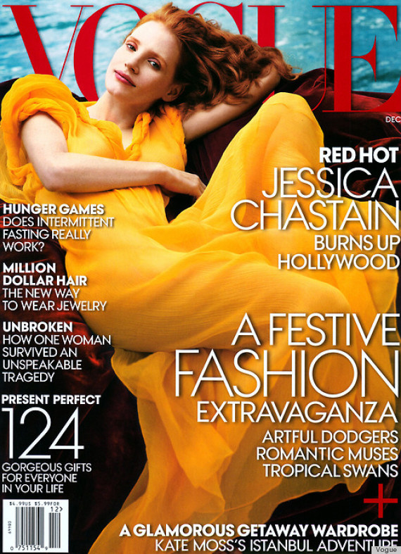
By the way, Lucky has a recently-installed new editor in chief, Eva Chen, who is something of a protégé to Anna Wintour. Wintour was named the “artistic director” to all Conde Nast publications (Lucky is Conde Nast), and Wintour’s presence will be felt on all Conde Nast fashion magazines from here on out. I wonder what Nuclear Wintour will have to say about this? I hope she won’t judge too harshly, considering this is the cover of the December Vogue… YIKES. Why put a pale redhead in Big Bird yellow?!!?

Covers courtesy of Lucky, Vogue. Additional photos by WENN.


WTH?! Why can magazines never make this woman look as beautiful as she is in person?!
I can understand editing away blemishes. We all have our good and bad skin days, but this is crazy bad! Mags have gone overboard.
she’s so much cuter than that
Probably because most magazines are trying to morph us all into looking – cookie cut out drab. If we see the “ideal” beauty all the freaking time then we will feel insecure and rush out to buy all the products that makes look like drab drabby nondescript girls. Kerry Washington is just unique – so they had to give her drab looks. That’s my theory anyway.!
I can’t believe that’s her, it doesn’t even look like her. Fail!
Seriously! She looks more botoxed than a Real Housewife!
One of the most beautiful actresses and they made her look like Trace Cyrus. She should sue, it’s THAT awful lol.
Trace Cyrus!!! Haha! She does unfortunately!
Omg, that’s funny and I had to google Trace Cyrus. She looks terrifyingly similar. Trace and Naomi Campbell.
You have to wonder who proofs these pictures??
That doesn’t even look remotely like Kerry and the entire styling in the Vogue cover is wrong. Aside from the dress colour, the make up is awful and the pose looks awkward (her left arm looks like a stump).
I agree. It looks like this was a collaborative fail by the staff of Lucky, not just one person’s misstep.
LOL jeez Louise… that cover threw me off so completely that, for the life of me, I could not remember what she actually looked like.
Bad, bad, bad.
Nah.
Not so lucky, really. Usually the photoshopping aspires readers to an unattainable beauty standard. In this case, they have done quite the opposite to a gorgeous woman; they pulled her down a few rungs. I wonder if the photographer had a major photo shoot fail and this was the best that the editor could come up with?
oh my god. that cover photo is horrendous. wow.. wow
Jessica Chastain’a cover is inspired by a famous painting called “Flaming June” by Frederic Leighton. It’s a gorgeous painting and a decent cover, imo. The only weirdness is how she posed her head, but they can’t follow the painting exactly or she’d have to be asleep. I can’t attach the picture for some reason, but check out this link and the cover will make a lot more sense. http://www.micheldoucet.com/images/gestion/flaming_june.jpg
The Flaming June is much more beautiful, interesting, and inspiring than the Jessica Chastain cover.
The Lucky magazine photoshop of the ever gorgeous Kerry Washington is just unfortunate.
I thought of that painting as soon as I saw the photo.
I kind of like the cover – the yellow is really bold and pretty, I think.
That cover is definitely a reference to Flaming June, although, I think it would have been more interesting if they’d either shot the cover image from another angle or possibly just copied the same pose. The actual Vogue cover as-is seems very kitschy.
JFC what is bad fan art drawing hell is this??? Give them the Razzie Award of photoshop already, has Lucky ever done a cover mag right?? Urgh!
“Bad Fan Art” very aptly put, Violeta.
Her hair looks nice though.
Her hair reminds me of my childhood manga crush Captain Harlock on a bad hair brushing day or hair ironing…
Bad fan art LOL omg can’t unsee so true! ! !
Horrible cover.
She is a gorgeous woman. This cover is atrocious, truly. She looks alien-like. Tragic fail!
I actually like Jessica Chastain’s cover but Kerry Washington’s is AWFUL. She is so beautiful, what happened?!
She is completely unrecognizable. And what’s up with that horrible pose? It seems to be a thing lately and it looks terrible!
The person and or persons responsible for this cover should offer Kerry a public apology, then be fired.
Kerry looks like a cross between Naomi Campbell and Angela Bassett. I don’t know if that’s a bad thing since all 3 ladies are beautiful.
Jessica looks beautiful — love her cover. I am not sure why, but Kerry bugs me. I don’t find her attractive or very interesting. She never seems to photograph well. You’d think Lucky could have worked Kerry’s cover better. It is horrendous.
Both covers are bad. I could do better and it’s not even my job.
Why do they keep doing this? People don’t look real anymore, it’s sick. Airbrushing used to be one thing, but this is beyond reason. Saw a bad photoshop of Christina Aguilera yesterday where one of her fingers had been morphed into something alien looking.
Eeek…no good! She’s so gorgeous why would they mess with her face like that?
There are a thousand kids on Tumblr who could do a better Photoshop job than that Lucky cover. Actually, the whole set-up is a FAIL. What is up with that pose? Looks like the art director and/or editor did not get the exact expression they were aiming for (which I bet was quite unnatural) so Kerry’s face was over-manipulated in Photoshop. Terrible job all around.
Jessica’s cover is all right but the color palette looks dated to me. Maybe that’s the point.
Pretty sure Vogue had the painting Flaming June by Frederic Leighton in mind for that picture. Go look at it and see what you think.
Awesome catch!
OMG Kerry’s cover is terrible. She is SO pretty, why mess with that? Why use a celebrity on the cover, only to make them unrecognizable???
I’d love to see a side by side of the original photo and that mess. I wonder if Kerry will say anything about it.
Wow, she’s so gorgeous naturally and that photo is horrendous…BTW, I have a neighbor who looks JUST LIKE her…lucky lady. My son is soooo in love with her!
She looks a little different but still beautiful.
“Kerry is so beautiful, and she has such photogenic, delicate features. She also has great skin, a beautiful smile and warm, beautiful eyes.” Yup 🙂
As to “Why did they lighten her skin??” I think they actually darkened it a bit on this cover (see pic below of her natural skin tone in the gold dress) which is incredibly unusual as the American media is OBSESSED with making all women of color appear more Caucasian in all editorial shoots (see: every African American actress or singer in any magazine cover/spread; full-on white Beyonce in every.single.L’Oreal add; Sofia Vergara’s beautiful brown eyes ‘shopped pale green in the Cover Girl mascara adds; and don’t even get me started on the bizarre lighting on the set of “The Mindy Project” that is CLEARLY designed to make her look shades upon shades lighter than in actuality [remember Kelly on “The Office”??]. To make matters worse, Mindy is the show’s creator so clearly she signed off on it. Sigh.) Viola Davis perfectly dubbed this Hollywood’s “darker than a paper bag syndrome” and as a proud biracial woman-hell, as a woman in general-this phenomena breaks my heart and p*sses me off in equal measure.
Good point, well said!
Thanks @Danskins 🙂
absolutely. My sister in law saw Beyoncé at the airport here in Melbourne and was shocked at the real colour of her skin, after seeing her in so many ads.
WHUT. DA. HAAAAIL.
That’s just dreadful. HOW do you make a woman that beautiful look that bad?
It’s like they went out of their way to do it, or something…ugh! 🙁
I think Kerry is very pretty and I tried to watch Scandal a few times… But there is just something about the way she moves her mouth when she speaks. I don’t know – it just bugs
Kerry shouldn’t have had that nose job.
Terrible just terrible, what a shame.
If the magazine doesn’t sell well, management will probably say it’s because there’s a black woman on the cover, not because the photoshop took the beauty out of her.
I think they morphed her with Padma Lakshmi… those look more like her eyes than Kerry’s.