
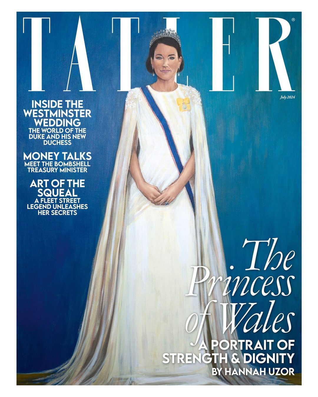
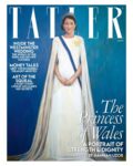
Real talk: the more I look at and evaluate Jonathan Yeo’s “blood-soaked” portrait of King Charles, the more I love it. I’m not pretending to be a professional art critic or anything, but I love the sub-genre of “discussions about artwork done with royals-as-subjects.” Yeo’s portrait of Charles is thought-provoking, evocative and it’s just a really interesting painting overall. The fact that Yeo actually captured Charles is the icing on the cake. Compare Yeo’s portrait to Hannah Uzor’s Tatler-commissioned portrait of the Princess of Wales, and Uzor’s is found wanting. It’s not striking, it doesn’t look like Kate, and the whole piece is so flat and lifeless.
Outrage and opinions followed the unveiling of Yeo’s portrait of the king. Charles’s name was trending on social media for days as everyone dissected the painting. Mainstream, international outlets got in on it too, everyone wanted to talk about Yeo’s portrait. It feels like Tatler is trying to force the same thing about Uzor’s portrait of Kate, only everyone just flatly hates it. The Telegraph’s art critic Alastair Sooke called Uzor’s piece “intolerably bad.” Some of his review:
Sorry, who is she meant to be? The Princess of Wales? You could have fooled me. Even by the standards of modern royal portraiture (and there have been many abominable likenesses of senior members of our royal family produced over the past century), Tatler’s new cover image – an “exclusive” portrait of the Princess of Wales by the British-Zambian artist Hannah Uzor – is egregiously, intolerably, jaw-hits-the-floor bad.
I’ve spent the past hour or so – time, incidentally, that I will never get back – scrutinising Uzor’s “likeness”, and, still, I cannot divine any flicker of resemblance between it and the woman it’s supposed to depict. At first, my editor thought it was meant to represent Meghan, Duchess of Sussex; its subject’s smirk made me think, initially, of Anne Robinson fronting The Weakest Link.
Has there been a flatter, more lifeless royal portrait in living memory? (It’s no surprise to learn that Uzor based her picture on video footage of, rather than personal sittings with, her subject.) Beneath a Lego-like helmet of unmodulated, monotonously brown “hair”, this Princess of Wales has as much charisma as a naff figurine atop a wedding cake.
She holds herself with the bored bearing of an air stewardess about to begin an in-flight safety demonstration – which is additionally awkward, given that this was a job once performed by Catherine’s mother (a fact that, in years gone by, reportedly attracted the ridicule of William’s snobbish friends).
Even her outfit (which she wore to the King’s first state banquet) appears stiff, with that rigid blue sash restricting her like a seatbelt. Her tiara doesn’t sparkle and those diamond-drop earrings fail to shine; towards the image’s bottom edge, her gown seems to disintegrate into streaks of brittle wax, like something desiccated and shrivelled worn by Miss Havisham.
The Miss Havisham reference is WILD, as is the air stewardess reference, OH MY GOD. Sooke really hates the bejesus out of this piece. Someone else who hated it? “Royal commentator” Michael Cole:
Discussing the portrait of The Princess of Wales which appeared on the latest edition of Tatler, Mr Cole told GBNews: “It’s dreadful, isn’t it? It’s as dreadful as Jonathan Yeo’s red portrait of the Red King was brilliant and wonderful.
“It is really a daub, a most dreadful daub. But what Tatler’s doing sticking it on the cover? I have no idea at all. I think she’s got the garter sash right. Everything else is wrong. Certainly the features, certainly the deportment: everything about it. I have no idea why on earth that would be put on the cover of such a long-established, well, it’s the Toff’s bible, isn’t it? Tatler. I don’t know what they’ll think of it at all, and I don’t think it’s helpful either, because at this moment, as we know, Kate, The Princess of Wales, is undergoing treatment for an unspecified cancer.
“To have a picture of her, which might have been done by that man who did The Scream, [Edvard] Munch. Mr Munch might have done this if he’d thought of doing a portrait of the Princess of Wales. Now I think it’s best forgotten. I think it’s one of those magazines you just want to turn it over and see the advert on the back page.”
Some of you suggested something similar, which is that Tatler was being purposefully shady by commissioning this portrait and putting it on the cover. While that’s absolutely a possibility, am I the only one finding this hate for the piece a bit… dramatic and performative? While Uzor’s piece looks nothing like Kate, it’s also not unflattering, per se. It’s not like Uzor depicted Kate as slovenly or squatting down to take a dump. Uzor captured Kate’s authentic “flatness,” her dull two-dimensionality. Maybe that’s why the royalists hate it.
General election? There’s only one debate in Britain right now: where do you stand on the new portrait of the Princess of Wales for the cover of Tatler?
Get the inside scoop in Tatler’s July 2024 issue, on sale 30 May. https://t.co/KZ0QuX1gRS pic.twitter.com/LQVZU0FNj2
— Tatler (@Tatlermagazine) May 23, 2024
Photos courtesy of Cover Images & Avalon Red. Cover courtesy of Tatler, portrait courtesy of Jonathan Yeo.
-
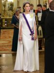
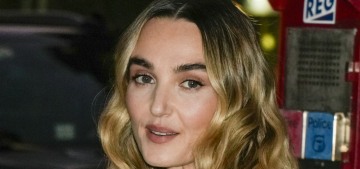
- LONDON, ENGLAND – NOVEMBER 22: Catherine, Princess of Wales during the State Banquet at Buckingham Palace on November 22, 2022 in London, England. This is the first state visit hosted by the UK with King Charles III as monarch, and the first state visit here by a South African leader since 2010.,Image: 739544792, License: Rights-managed, Restrictions: NO UK USE FOR 48 HOURS- Fee Payable Upon reproduction – For queries contact Avalon sales@Avalon.red London +44 20 7421 6000 Los Angeles +1 310 822 0419 Berlin +49 30 76 212 251 Madrid +34 91 533 42 89, Model Release: no, Credit line: Avalon.red / Avalon
-
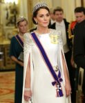
- LONDON, ENGLAND – NOVEMBER 22: Catherine, Princess of Wales during the State Banquet at Buckingham Palace on November 22, 2022 in London, England. This is the first state visit hosted by the UK with King Charles III as monarch, and the first state visit here by a South African leader since 2010.,Image: 739545133, License: Rights-managed, Restrictions: NO UK USE FOR 48 HOURS- Fee Payable Upon reproduction – For queries contact Avalon sales@Avalon.red London +44 20 7421 6000 Los Angeles +1 310 822 0419 Berlin +49 30 76 212 251 Madrid +34 91 533 42 89, Model Release: no, Credit line: Avalon.red / Avalon

-

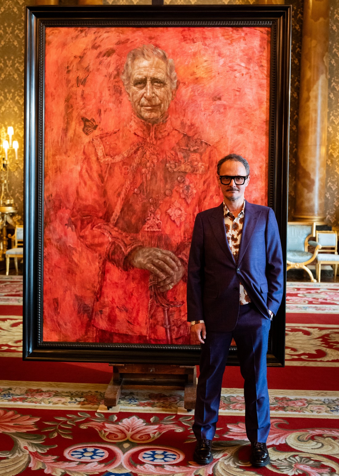
- Artist Jonathan Yeo, at the unveiling of artist Jonathan Yeo’s portrait of the King, in the blue drawing room at Buckingham Palace, London. The portrait was commissioned in 2020 to celebrate the then Prince of Wales’s 50 years as a member of The Drapers’ Company in 2022. The artwork depicts the King wearing the uniform of the Welsh Guards, of which he was made Regimental Colonel in 1975. The canvas size – approximately 8.5 by 6.5 feet when framed – was carefully considered to fit within the architecture of Drapers’ Hall and the context of the paintings it will eventually hang alongside Featuring: Jonathan Yeo Where: London, United Kingdom When: 14 May 2024 Credit: PA Images/INSTARimages **NORTH AMERICA RIGHTS ONLY**
-
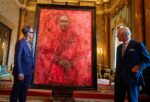
- Artist Jonathan Yeo and King Charles III at the unveiling of Yeo’s portrait of the King, in the blue drawing room at Buckingham Palace, London. The portrait was commissioned in 2020 to celebrate the then Prince of Wales’s 50 years as a member of The Drapers’ Company in 2022. The artwork depicts the King wearing the uniform of the Welsh Guards, of which he was made Regimental Colonel in 1975. The canvas size – approximately 8.5 by 6.5 feet when framed – was carefully considered to fit within the architecture of Drapers’ Hall and the context of the paintings it will eventually hang alongside Featuring: Jonathan Yeo, King Charles III Where: London, United Kingdom When: 14 May 2024 Credit: PA Images/INSTARimages **NORTH AMERICA RIGHTS ONLY**


Perhaps it’s a reflection of what she looks like now.
Perhaps and maybe the artist maybe got the lifelessness that is really Can’t.
Looking at Uzor’s other works, it’s an interesting choice for Tatler’s commission. They absolutely knew what they were doing. I also feel that there’s some interesting commentary in that painting. It’s a fine line for an artist when you have to balance commercial viability versus expressing exactly what you feel.
I agree VespaRed, I looked at the artist’s other work, and it’s much more engaging and interesting than this, making me wonder if it’s intentionally flat, or if it was rushed or something.
Spot on, really.
“Has there been a flatter, more lifeless royal portrait in living memory?”
Wrong question, Sooke.
Right question:
“Has there been a flatter, more lifeless royal in living memory?”
Given where most of us think she’s been since last December… ?
Tatler here is throwing copious amounts of shade at the Palaces, Kateatonic Missington, and Mme. Doors-To-Manual. I suspect they are Team 🥀 over at Tatler…
Oh you said it out loud lmao
This! My thoughts too!!
I really like the painting. I think the woman in it is pretty, but it doesn’t look like Kate. I think the artist did an amazing job, making Kate look better than she ever has in real life. They didn’t get this much backlash from that devil worshipping picture of Chuck. I wonder why? Could it be because this artist is of African decent? 🤷♀️The world will never know.
1960tim – my thoughts exactly! I think it’s a great portrait, much better than the red king! Definitely an artist difference!
It’s like she’s wearing a mask. I do love the background colors.
Looks nothing like her. At least the red painting looks like Charles
It’s almost like the portrait is giving them an excuse to talk the shit about Kate they’ve always wanted? Those complaints are rather…specific and recognizable in these parts.
Air hostess. A reference to her mom? Miss Havisham? Reminds me of those fluttery black and white photos that Kate commissioned for herself on some occasion too boring to remember.
I think the portrait is fine except for the face. It’s like an amateur painting where a person can capture scenery but not something as subtle as a face.
@Snaggletooth This was my thought as well!
he even managed to bring up Meghan! that review is savage.
it definitely looks nothing like Kate. perhaps it’s meant to be the farm stand chick!
the Charles painting otoh is brilliant.
I don’t hate it. It doesn’t look like Kate but I assumed it was just the artist’s style. Like the Modigliani version of Kate.
Same. I think people are being a little extra about this piece. No, it’s not an exact photorealistic representation of its subject, but not all portraits are or even have to be. Art is so subjective. There’s no need for people to be so shitty about it. Sigh.
Jais, the writer of the article did not attribute the smirk to Meghan Markle, she attributed it to the former host of the game show The Weakest Link
Totally with you two. It makes you think and I think there are interesting parallels with the actual princess.
They could hardly praise the painting for capturing Kate’s dullness, so they have to explode with the typical orgy of outrage at any perceived slight against the RF.
I also really like the portrait of Charles for several reasons.
That actually captured KC’s likeness though. If you don’t recognize the face of the depicted person you are looking at, it’s not a good portrait. Trying to improve bad work by imbuing it with shady meaning post hoc doesn’t really cut it.
Kate’s face has changed over the years, and it will change even faster with age, as she has whatever work is needed to try to look young-ish. So what does it matter? There’s a chance she could look like this one day, depending on the surgeon. It’s as good a guess as any.
I am weirdly split on this Meredith. Because on the one hand I completely agree, but on the other hand I looked up the artist and they *do* know how to paint. The work is *good*. So… what is this?
I was shocked by it at first, but the more I see it, the more I think it’s pretty great, and has inspired SO much interest and conversation.
Sorry, this looks like a ghost. The lady in white walking in the wall of Kensington Palace haunting Bully Boy and the rest.
Isn’t it the point though? She never shows her personality during her 20 plus years in the British spotlight besides her “Reindeering” ability & the somehow “maniac” laughing facial expression? ( Charles has personality.)
A portrait is not a photo, it presents the artist’s interpretation of their subjects. It’s harder to capture a person’s personality than paint a look alike. Even the TV show “Portrait Artist Of The Year” has not always picked the winner by the standard of likeness.
But the artist didn’t commit to making the portrait a representation instead of a likeness.
For example, that the artist who painted the portrait of the Aussie billionaire that she absolutely *hates* fully committed to emotional representation. The artist was skilled enough to demonstrate that yes, this is EXACTLY who this is supposed to be, while going off in a very interpretive direction.
Kate’s portrait is just boring.
It’s flattering generic white woman (I keep thinking it’s Queen Mary), which no real connection to Kate.
If Tatler wanted the portrait to be scandalous, they should have committed and made it so that there was absolutely no doubt it was Kate.
But isn’t that the point of the portrait? That Kate is just a generic white woman? She can be easily exchanged with another?
I think you’e on to something there. Doesn’t the ghost of Catherine Howard haunt one of the palaces?
Agreed. An artful evocation of Wallace Stevens’ “The nothing that is not there, and the nothing that is.”
It’s awful in so many ways – the gray undertones of the color palette, the flatness, just the overall drabness… and the lack of life (hmmm?). Like a bad waxwork. And of course looks nothing like her – but for that outfit, no one would have guessed. But that said, a slate of art directors and editors got together and put it on the front cover. That was not … as the annoying kids say … an “on accident”…
Lots of people have commented that the artist is talented and has produced some great looking works if you look at what she has painted beyond this image so it does feel that there is a lot of ‘on purpose’ about all of this. It’s faceless and stiff because Kate is just that, we have no idea who she really is (beyond a petty mean girl).
Lifeless waxwork….reminds me of the Madame Tussaud’s replica I saw of Keeny, truth be told that replica had more life in it, but I love the shade. Cardboard Queen, a new hit from party pieces.
“Beneath a Lego-like helmet of unmodulated, monotonously brown “hair”, this Princess of Wales has as much charisma as a naff figurine atop a wedding cake.”
I mean…that IS Kate tbh? She’s never been charismatic, unless royalists and the British media consider her constant flashing, hyena grinning, and endless wiglet tossing “charisma”. Kate has always had the benefit of being elevated by comparisons to the circles she inserts herself into. With the aristocrats, she’s often considered ‘pretty’ versus the likes of Jecca, Rose, etc. even though she’s truly average at best. With the RF itself, she’s considered more ‘interesting’ simply because she’s one of the few ‘young’ royals and she wears designer clothing. There’s truly nothing to Kate, and this portrait captures that nothingness perfectly.
I remember an interview with William in which he talked about Kate’s hair being almost its own character— a thing completely separate from Kate the person. From this I inferred that Kate might have more personality in private than she lets on when she’s in her princess uniform with her princess wiglets. I think she plays a role in public. That doesn’t mean she is an empty vessel in private.
But we’ve already heard what she’s like in private via the turnip toffs in the infamous “Catherine the Great” Tatler piece. They basically said she was cold, dull, uninteresting in general, and a tad manipulative. Those are the same people she mistakenly considered her friends until she tried to throw her weight around and push one of them (Rose) out of the circle. And even before marrying William, she’s been said to be arrogant and ‘grand’ just like him; Beatrice and Eugenie would know that well. Yeah, Kate’s deliberately presented herself as a tabula rasa since joining the royals, but there truly doesn’t seem to be much to her in private either, based on the stories over the decades.
she’s devoid of charisma, not even a drop of it.
she has been described at best as goofy maybe with William, but also routinely as cold, aloof, a mean girl and a bully even among “friends.”
She chooses to project emptiness or she is empty. Neither is a recommendation.
Not only the turnip toffs, but her own family described her this way – insular, dull, and devoid of curiosity in anything other than relating to herself/her family/Willy. Those were the words from her cousin (around the time of the marriage) and her nasty uncle. Other than supposedly holding her own during their many, many rows, and being super competitive with Will, her family even say she’s as dull as a doorknob in private.
Meredith – I took Willy’s comments to mean her hair has a life of its own. As in, way too much of it, it gets everywhere, it’s fake, etc. Not that somehow her having loads of hair as part of her public royal uniform means she has some sparkling personality in private.
Agree. Those descriptions do describe Kate’s public image. Brown hair and no charisma.
I said similar on yesterday’s thread, but I think the stiff, blank canvas, facade-like portrait captures Kate’s essence a lot better than royalists want to admit.
I’ve long thought Carole is probably a narcissist and William certainly is. As someone raised by a narcissist, I can attest that it’s virtually impossible to develop your own personality unless/until you break away from the narc’s influence. But Kate never has, which is why we see her constantly borrowing looks, interests, and mannerisms from others.
I’m sure the artist can handle the heat, but I feel bad she’s getting so much criticism for painting something that IMO reflects a deeper truth about Kate and about the monarchy.
I think you are spot on with this.
For sure, the artist’s style is non-photorealistic and more veering toward abstract realism. The perspective in the features of her subjects appears to be purposely off/ intentionally slightly off-angle. In addition, Kate did not sit for this portrait, which also makes a difference in the approach taken and the eventual outcome.
I fully agree with your comments @Salmonpuff. Regarding your final observation, it’s important to notice that Uzor said she was trying to convey Kate’s grace and dignity 🤭. Thus, the question becomes, ‘Was that Uzor’s true intention, or is she just saying that for p.r. purposes?’ If true on Uzor’s part, obviously that is not what the painting conveys exactly because in reality Kate has no personal style, no grace, and no dignity. Period.
No matter how hard an artist might try to present something in a portrait, if that something doesn’t exist in the subject, then what doesn’t exist will not be revealed. LOL! Even that earlier close-up painting of Kate, also done from a photo, reveals Kate’s smug, self-satisfied mean streak (again, probably through no intention by the artist).
This is clearly a very talented artist who has done some wonderful portraits. My criticism, such as it is, is that her message is getting lost. Perhaps she was saying something about Kate by making it generic and unrecognizable, but by being unrecognizable, the general viewer may not be getting the message she was trying to portray. Perhaps there are some art scholars who will pick up on it but I find that approach snobby if the casual viewer cannot be drawn in beyond the superficial without advanced education and theory. To me, the initial casual take is “who dis” and the conversation is not going beyond that.
Charles portrait was so fantastic because it was such a recognizable likeness but everyone could read into it their own interpretations of the empire, butterflies, blood, evil, etc.
I think all these critics who hate the flat portrayal of Kate (in effigy?) are seeing the highly talented artist’s (and Tatler’s) intent quite clearly. They just don’t like that intent.
Oh they knew, they just refused or were afraid to offend the Great White English Rose & the BRF.
The “flat” painting style is nothing new. Go see the early (Medieval) Religious paintings exhibit in the museums, some of those Religious figures’s faces were like that–very flat.
Maybe she was watching the footage and pictures of the many faces of Kate KP has released the last 6 months. She might have got confused.
So the person in the portrait is wearing Kate’s dress, sash and tiara, but this dumb-a** editor thought it was supposed to be Meghan? Why?
Maybe because the artist paints a lot of portraits of black people? And those portraits are gorgeous. Which really, really makes me wonder why Tatler commissioned her to paint Kate’s portrait.
They tried to attribute the smirk on the face to Meghan. As if Kate has not been photographed smirking on so so many occasions. Yes, Kate smirks.
I don’t even see a smirk, I see the usual tightening of the lips when Kate is displeased with something.
Royalists definitely see Kate as this great beauty with poise and personality. I think the portrait does not look like her but I think the artist got her true essence. She’s flawed, mediocre and has no personality or charisma. I think part of the hatred for Meghan is because she’s more glamorous and outgoing than Kate.
it looks like when my coffee shop has art from the local high school
Exactly.
I looked at Uzor’s website and her instagram, and this portrait just doesn’t seem to fit in with her style at all, there’s no shading or light in the face and no real detail except for the difference in her eyes.
I really thought the portrait of Charles was amazingly creative, more than “just” a portrait, but real art
One was painted by a white man. One was painted by a black woman. Only one is allowed to be “art.”
I don’t care for either portrait, not my style. But, at least you can see KC in his. I don’t see Kate at all.
Interesting mention of Meghan’s features, the nose and cheeks are more Meghan than they are Kate, but even then nope.
I still can’t get over how most artists don’t see or capture Kate’s down sloping eyes, which are very distinctive, much like they are on Katie Holmes’ face.
but yeah this does give air hostess vibes. I didn’t see this as deliberately shady until they mentioned that. Eeek!
We KNOW Tatler is first class at trolling Kate. They know exactly what they are doing, and so do the critics who mention the dreaded “Doors to Manual” nickname.
Tatler is first and foremost by and for the Toffs, and maybe they just couldn’t resist getting in some digs at Kate while she is out of sight. Or maybe this is some subtle encouragement for her to stay away and just let TOB live out his single dad lifestyle at the various society weddings, parties and shooting weekends. Not that Kate really needs an excuse – she was never part of their world. They are just making painfully sure she remembers that.
Quite, I bet CarolE was thrilled to read that. They know exactly what they’re doing.
Is it just me that thinks the portrait is exactly the way kate portrays herself. She is lifeless, her dresses do not compliment her, her speeches come off rehearsed and boring. Need I say more.
That’s not the Garter sash, it’s the Victorian Order sash.
She did get Kate’s hands right.
I think she got the clasped hand thing, too. Also the shoulders which hunch. Her posture in essence. She kind of looks matronly and young at the same time.
First: Aesthetically, I like it.
Second: Politically, I like it. It’s a very ‘flat’ painting that, in shape and color, appears all surface. there’s no interiority or sense of the subject’s personality depicted. this is perfect for kate, who is all surface and no depth. honestly, i think the artist hit the nail on the head with this one. it’s very “go girl, give us nothing.”
The more I look at this, the more I see emptiness and whiteness.
It’s giving boring white girl hanger, which to be fair is totally Kate’s vibe.
Kate’s portrait reminds me of the image on the package of the McCall skirt pattern we used in my 7th grade sewing class.
Yes! Excellent description!
Tatler are really throwing Hannah Uzor to the wolves with that tweet as if they weren’t the ones who commissionned the piece in the first place.
The portrait in itself reminds me of the meme that says something like “Adam Driver looks like he’s been drawn from memory by somebody who was trying to draw Keanu Reeves”.
I think it’s an unflattering portrait— and an absolutely excellent work of art. This is in contrast to Charles’s which I think is both an excellent work of art AND flattering. I think the portrait of Kate portrays what’s really there — and does it well. It catches our attention as viewers, and encourages us to look deeper at a multiple levels and complexities— as good art does.
Agreed @Blithe.
I think I agree.
I think the Telegraph’s critique sounds more like a biographical snapshot of Kate than an attack on the portrait. They got some digs in. The reason people hate this painting because it doesn’t give Kate any depth or personality because either she lacks it, or it points out her very real absence. It looks like a cheap plastic doll version of Kate. They are all upset because despite what the artist says, this portrait is devoid of flattery and they desperately want that for her right now. It’s an accurate portrayal.
That’s it, it does look like a cheap dimestore plastic doll, the plastic so thin it caves in to the touch, with arms held in place by rubber baands. 🙂 🙂
Honestly, the first thing I thought of when I saw the portrait was the essay by the late great Hilary Mantel, especially this part: “Kate seems to have been selected for her role of princess because she was irreproachable: as painfully thin as anyone could wish, without quirks, without oddities, without the risk of the emergence of character.”
Matches her husband, a pair of automata.
@robinathefirst nailed it with the Mantel reference. All future Caroles and Kates should ponder this depiction and Mantel’s words. All the RF and BM want is a silent, grateful. compliant, thin white girl, NOT INTELLIGENT WOMAN. There is a snap of Kate with her arms wrapped around two school girls , laughing naturally. Yes I understand she also made a choice but the aching void between the 2 depictions: the potential Kate had and what she has become I find very sad.
It’s a bad wax statue, but in painting. Do I make sense?
Yes!
I still think it looks like it was done by a school kid however the slightly hunched shoulders and posture are actually spot on. That someone thinks the deportment is wrong? What deportment does Kate have? She’s round-shouldered, and can’t stand up straight for anything.
It’s a portrait of the Princess of Wales, which is an empty, flat position that’s meant to be filled by someone who has no sparkle of their own. We’ve seen what happens when someone who marries in attempts to have a personality. This is a true depiction of what they want from a POW. It’s almost anonymous really; a portrait of a title more than of a person
While Charles’ portrait is highly extra at least it’s clearly him (great for the memes alone, the one comparing it to Vigo’s painting in Ghostbusters was sending me 💀)…Kate’s is giving Gina Carino which I am pretty sure was not the goal.
After seeing the absolute flatness of this image – the lifelessness of it all, the extra elongated torso, the empty stare and unrecognizable features – the very next thing I see are the broad hips that kittykat spent her life trying to get rid of and now the artist has given them to her in spades.
:-):-):-):-):-):-):-):-):-):-)LOLOLOLOLOLOLOLOLOLOLOLOLOL:-):-):-):-);:-):-):-)
You made me look, Kingston, lol!
The thing is Yeo’s painting was brilliant. It was a very good painting, capturing Charles’ likeness and also perhaps his essence. Was it a great choice for an official portrait is debatable, but I truly loved the painting.
Uzor’s painting is just bad. I look at this painting and think…thank goodness I’m not paying her to do my portrait.
This painting is awful. If she meant to portray Kate as empty and boring a great artist could convey that through her painting and have the painting actually look like the subject.
The picture looks like something a talented 5th grader would do, which they would deserve praise for. In this case, not so much. The portrait looks nothing like Kate. It should be so easy to paint her, she is classically pretty and thin. But no.
Well, Britain is paying Kate to be the PoW and future queen. The painting captures exactly what they’re getting. So where is the outrage about THAT?
Uzor is an immensely talented artist — just take a look at her body of work. Tatler was sending a message, but hid behind a Black woman to send it. Just like the cowards who didn’t defend Meghan.
@carman Agree 💯 there’s a reason why they chose a black woman artist. It’s Kate, cutout of a white paper doll. PERIOD.
I think the portrait Kate looks less mannish than real life Kate. Also, how come no one thinks ANY portrait of Kate is good. Must be the subject.
I’m wondering when this piece was commissioned, how long Uzor was given before completion for publication, and how much Tatler paid for it.
I read somewhere that it took Uzor 3 weeks to complete – I didn’t see anything more about the commission to publication timeline.
Kate did a photoshoot a few years ago for her birthday. Those photos didn’t look like her either, but I didn’t see the royalists crying about that.
She made the whitest woman look Asian.
I think Tatler and the artist of the painting are trying to tell us something about the current state of Kate.
I think its very safe to assume that there are plenty of aristos who are NO fans of William, have heard plenty of the whispers about what really happened to Kate, and are more than happy to expose William, in a subtle, oblique, aristo-style manner, of course. One that reminds William that he might be soon to take the throne, but that they have just as much social power as him, if not more
I dunno – I kinda like it as a cover illustration!
(it’s no Maira Kalman, but there ya go)
Illustrative of the character of these amateur art critics and royal experts to use this painting as an excuse to diss Meghan, Anne Robinson (gal dating Andrew Parker Bowles), and other women they don’t like, isn’t it?
Let’s not ignore the dig at Ma Middleton and Waity Katie!
Tell us what you really think, guys.
Where was the dig at Meghan? Really asking! And don’t get me wrong, I’m very surprised that the “art critic” DIDNT use her critique to base Meghan! At least not that I saw
This isn’t as bad as the joint portrait of William and Kate — the one where Kate’s head and body are facing different directions, Kate and William are not gazing at the same place, Kate is wearing a hideous Nancy Reagan “old lady”-style green dress, William has a comb-over, and William is standing with one hand in his pocket and his leg splayed. By comparison, this Tattler one is nice.
I say, they are testing the waters if people still remember how she looked like. Now they know, and here comes the announcement she wont be seen for another couple of months.
For me the biggest thing that points to this being a major statement about Kate as a person and Kate as an image is that the artist deliberately removed the lover’s knots from Queen Mary’s Lover’s Knot Tiara.
Without those lover’s knots the dangling pearls just dangle there in mid-air, suspended by nothing, creating a fully impossible tiara. That was a CHOICE.
Sorry, I don’t care for any of her 3 portraits of the royals. Her QE2 looks like a cardboard cutout doll where dresses were placed on with folded ‘tabs’. Does not look like a real person. Charles looks like a faintly sketched image ….something which would head up a story in the New Yorker….just a sketch really. This portrait of Kate? Really? She’s elongated like some of those depicted on century old tapestries.
I’ll pass on her work! All 3 look dead, maybe that’s because Liz is actually deceased;Chuck is working on it (his cancer of unknown ,to us, origin and Kate? her state is a mystery.
The Red portrait of Charles, on the other hand, is brilliant! I could look at it for hours.
It’s reminiscent of Milania Trump wearing her “I Don’t Care” coat while boarding a plane.
Kate’s portrait reminds me most of the Japanese princess who was almost destroyed by the stress of becoming royal. Perhaps the artist intended that.