

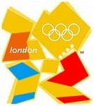
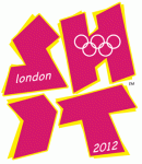
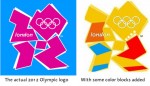
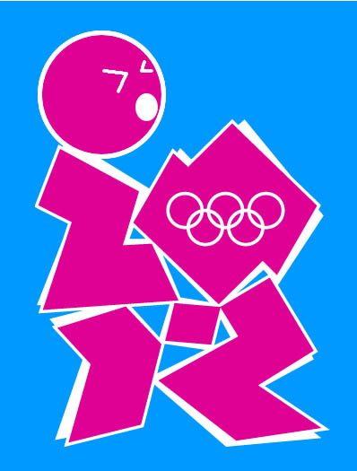
This is really inappropriate and wrong, but someone added some color blocks to the very poorly-designed 2012 London Olympic logo to make it look like Lisa and Bart Simpson engaged in well, you can tell for yourself. Our friends at Smaknews linked to this Facebook group titled “2012 Olympic Logo looks like Lisa Simpson giving…” and I found it so damn funny. The logo is normally fuchsia-colored and it’s supposed to be a stylized chunky “2012,” but until I read that I had no idea what it was. It just looked like a bunch of cubic shapes to me. This logo first came out in the summer 2007 and there was a lot of buzz at the time about how lousy it was. The Guardian even ran an article noting the Lisa Simpson figure to the right called “How Lisa Simpson got ahead at the Olympics.” The London Olympics stubbornly retained the logo, though, and are using it on their website and merchandise. There’s even an version on their website with some stripes and a little curlicue added for flair. Unfortunately an earlier animated version of the logo had to be pulled because it could potentially trigger epileptic seizures. (I’m not even making this up.)
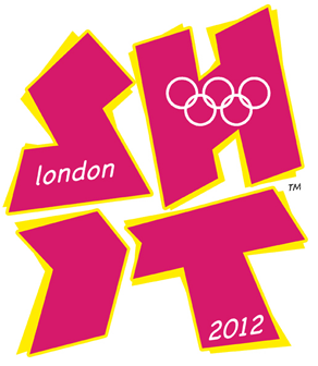
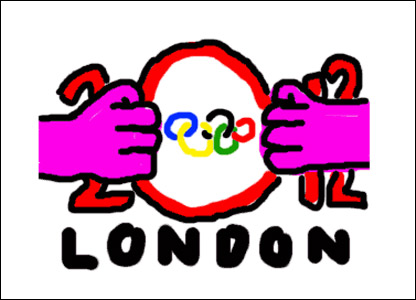
Other variations on this crappy logo include a head added to the left side to make it look like simple fellatio and a remix to make it spell out “Shit.” When the logo was unveiled to great mockery, BBC ran a contest for someone to submit a better version. One guy made a mockup based on the internet meme “goatse” (There is no way I’m linking that, google at your own risk) and the BBC showed it on the air without having a clue what it represented. It still would have been better than the fuschia fellatio blocks.


HORRIBLE logo. Still, this doesn’t surprise me at all, after the ridiculously embarrassing display of silliness that we did in the closing ceremony of Beijing, to present London’s candidature. I couldn’t help but to hide my face in shame as I saw the sheer beauty of what the Chinese had created, and then compared it to a London double decker bus, a clumsy choreography and Leona Lewis whining a song with her weak voice while wrapped in what looked like a shiny blanket.
Here in the UK, no one has faith in the 2012 Olympics being the most memorable in history, and if the logo and presentation are any indication, we are right.
so they should change anything that either a high school kid or a very immature 40 year old virgin with “skills” saw something dumb in ? the kid who came up with this probably jerks off to tetris anyway… he should keep his pimply nose out of the olypmics… *eyeroll*
Pont Neuf, feeling in Sydney prior to the 2000 Olympics was the same and then it was a fantastic event. Rest assured no matter how many cringe worthy pip-pip cheerio cup-o-tea chim-chiminy ‘icons’ they dredge up for London, it could never be worse than Atlanta.
You know what I saw when I looked at that logo? A chick giving a guy head. You know what I didn’t see? 2012. That’s what it’s supposed to say??
That is a terrible logo, even aside from the, um, unfortunate resemblance.
I am so over the Olympics and they haven’t even started!
We have the winter ones around the corner, and then all the hype for the next few years until London! UGH!
I like the goatse one!
I can’t believe that was actually the best logo submitted. It looks like something my 10-yr. old nephew did while playing around in Photoshop.
ITA with GatsbyGal. Nowhere in that hot mess did I see 2012.
This only firms my belief that Ireland would have been a better place to hold it.
The idiot who did this should be hung by his balls.
Pont Neuf – agreed. I’ve yet to meet anyone here who actually gives a toss about the Olympics.
And yeah, the logo is garbage. It doesn’t register to me as fellatio but then it sure doesn’t register as 2012 either. Poor, uncommunicative, ugly design… bodes well for the event itself, doesn’t it? Le sigh.
Oh, Pont Neuf, lighten up, eh? I for one thought it was a great breath of fresh air after hours of the Chinese going OMG U GUYZ LOOK HOW RELEVANT WE AREEEEE. The LAST thing Leona Lewis’ voice is, is thin, and she looked lovely in the silver gown and you know it. Why be dour? 😀
Honestly, I kinda hope the Canadian opening ceremonies is just a big extended Red Green episode (look it up). And the closing is Kids in the Hall. MAKE ‘EM LAUGH.
LMAO @ Ling
I think that may be the only way I’d watch the opening ceremonies voluntarily. And then Tivo it as well.
AAAAAHHHHHH!!!!!!!!!!!!!I googled meme “goatse” and I’m sorry I did!
That was worse then the time I looked up, “Pink Sock.”
I knew what Goatse was.. unforch, but thanks Babs, i can now add ” Pink Sock” so the list of things i wish i hadnt googled. Lol
Haha, goatse: pitcher and catcher.
Deciding..do I want to look up Pink Sock? Is it as bad as Two Girls, One Cup?
Holy Jesus! I just googled goatse and pink sock. And I now wish I hadn’t.
Don’t do it you guys! I have never looked at goatse, 2 girls 1 cup or pink sock (which I just heard of thanks so much!) and I hope I never do.
@Babs, seven and snowball: Holy Hell My eyes…there are just some things I wish I could ‘ungoogle’ *Shudders*
ETA: @Celebitchy, I should have heeded your warning. *Leaves thread to go lie down*
I, unfortunately, have already seen goatse.. I didn’t put two and two together until I remembered what it was and looked and the second picture…. HAHAHAHAHAHA… I would have NEVER put those two together… but now that you bring it up, it’s sooooooooooo right on… I wish my mind was that dirty 🙁
its horrid… but its the brits and they always like to make a stir… and it always works!! gotta love the brits
Oh it’s supposed to say 2012. I didn’t get that the whole way through. Stupid logo. How can people not notice that? It had to go through other tests? Or are these people not perverted as us??
Has anyone seen the mascots for the 2010 olympics in Vancouver? They are ridiculous! So is this Logo.
Time to scrap these games…..the world cannot afford to support the elite anymore. It’s pure politics and has nothing to do with the athletes. I live here and can hardly wait until they’re over.
It’s grown on me actually. I actually quite like it now.
@skibunny: lighten up. They’re adorable. AND YOU KNOW IT.
(bless me feathers, I’m repeating my self, self, self.)
The mascots are always cartoony animals of the indigenous mythology variety. What would you have them do otherwise?
Although I’ll concede that the nagano mascots are the best, and will remain so for a long time.
Well when the unemployment line ups are the longest they’ve ever been and there are more hungry people waiting in line at the food bank every day and health care is on the the rocks, plus we are coming out of the worst recession ever someone should be asking “why is Vancouver hosting this extravagant party?” Are your tax dollars paying for this charade?
And NO those mascots are not cute!
Hahahaha @ all these people in the comments googling goatse.
Hey, do me a favor and google “tub girl” and “lemon party” and while you’re at it, let me be the first to welcome you to 2006.
Last I heard, Damon Albarn was in the running to be the artistic director for the 2012 London Olympics. I’ll have high hopes for it if this occurs. I also loved the Monkey (Albarn/Hewlett) animated ads for the Beijing olympics.
For the uninitiated….. if you don’t know what something like goatse/2girls/pink sock etc is….don’t Google…. Urban Dictionary it. Your eyes will thank you.
I think maybe she’s break dancing.
You guys rock! I can’t tell you how many times I have laughed out loud — often just at the title. Caution recommended for those reading CB in their cubicles!
hahaha I joined this group on fb ages ago. Really quite amusing that they kept the logo. I also did not realise it was 2012 at first, and really, 2012 is the best logo they could come up with?! Imagine all of the people that pitched much better logos and lost out to this mess.. They would be laughing now!
The Vancouver Olympics logo sucks too, but not quite so literally
I’m not looking up goatse… i’m on the church computer !
BUT… yes our logo sucks!
(in more ways than one)
GatsbyGal, I knew tub girl; lemon party was something I could have died happily not seeing. Old people should not have sex.
I’m going to take this topic totally off the rails and say when I told my dad what a dirty sanchez was, I thought he was going to faint. Then he laughed so hard he farted. Woot!
It’s my lemon party and I will cry if I want to…..
ahhhhhh!!!! I just googled it, ew, ew ew, ew,ew, ew,ew ew,ew ack,, ejkjsdf;, ugh!
ackckkkkk! no lemon party! lemon party is wrong.
What on earth has come over Lisa and Bart??!?!
Hope Homer and Marge haven’t seen it yet…
looks like the lemon party…
This logo is approved by the Lanister Twin(cest)s.