
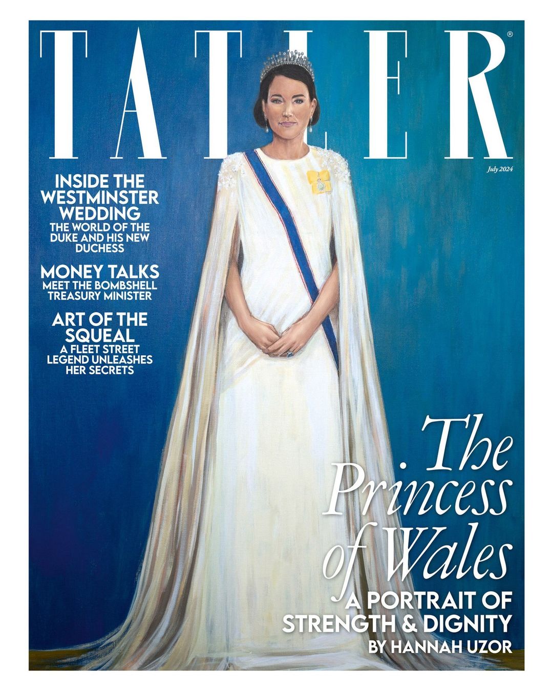
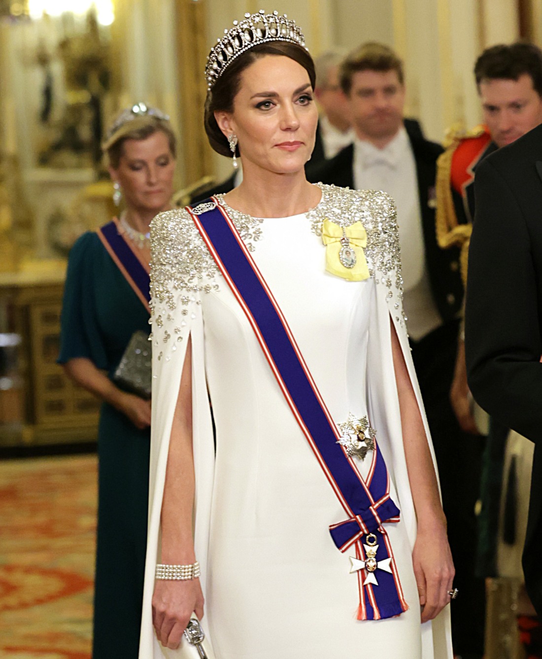
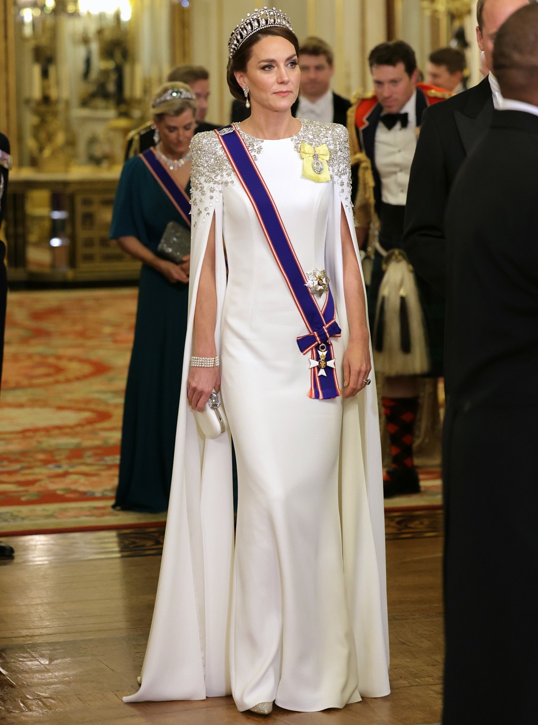
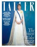
Tatler’s July issue features three covers – portraits of QEII, King Charles and the Princess of Wales. I wanted to talk about the Kate portrait, because this looks nothing like her. Tatler apparently commissioned Hannah Uzor to make a large-scale portrait of Kate, and Uzor pored over photos of Kate and based this portrait on Kate’s appearance at the state dinner for the South African president in 2022. It was one of Kate’s first big moments as Princess of Wales and she wore the Cambridge Lovers Knot Tiara, Diana’s Collingwood diamond-and-pearl earrings and a caped Jenny Packham gown. The photos of Kate weren’t bad, and the look was fine, if a bit uninspiring. Tatler wanted a portrait which would, as they write, celebrate “Britain’s royal star: the woman so many look to for strength, grace and dignity.”
Now, in a large-scale portrait commissioned by Tatler, Hannah Uzor depicts Kate in her newest role – The Princess of Wales.
‘She has really risen up to her role – she was born for this,’ says Uzor in our July cover story, adding that ‘she carries herself with such dignity, elegance and grace.’ The cover, crafted after the artist’s study of over 180,000 archival photographs, still manages to incorporate Kate’s personal passions; projects the public have witnessed the princess develop over many years. The green colour wash nods to her love of gardening, and its blue undertones to the time she spent rowing – a hobby that dates back to those years spent studying art at university.
Uzor – who was born Hannah Hasiciimbwe in Lusaka, Zambia and counts Toulouse Lautrec among her influences – has equally captured another side to Kate. ‘I sense with her the joy of motherhood,’ says the artist, who, like her subject, is a mother of three. More than ever, the image of the Princess sits between the dichotomies of royal portraiture, balancing the ceremonial and the sequestered. She gazes out of this month’s cover, eyes once again locked with the viewer: a princess, mother, wife and artist.
LMAO “The green colour wash nods to her love of gardening, and its blue undertones to the time she spent rowing.” Kate is a woman without passions but bless your heart for trying. And all of that for a portrait which looks vaguely like Minka Kelly. Also: this serves as a reminder that there really aren’t that many portraits of Kate. There’s the Paul Emsley one, there was one of Kate and William, and then there’s this mess. Well, at least it won’t go viral like King Charles’s brilliant portrait by Jonathan Yeo.
Cover courtesy of Tatler, additional photos courtesy of Avalon Red.
-
- The Princess of Wales with guests during the State Banquet at Buckingham Palace, London, for the State Visit to the UK by President Cyril Ramaphosa of South Africa. Picture date: Tuesday November 22, 2022.,Image: 739543968, License: Rights-managed, Restrictions: NO UK USE FOR 48 HOURS- Fee Payable Upon reproduction – For queries contact Avalon sales@Avalon.red London +44 20 7421 6000 Los Angeles +1 310 822 0419 Berlin +49 30 76 212 251 Madrid +34 91 533 42 89, Model Release: no, Credit line: Avalon.red / Avalon
-
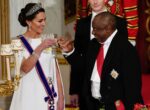
- The Princess of Wales and President Cyril Ramaphosa of South Africa, toast at the State Banquet held at Buckingham Palace, London, during the State Visit to the UK by the South African president. Picture date: Tuesday November 22, 2022. Photo credit should read: Aaron,Image: 739544195, License: Rights-managed, Restrictions: NO UK USE FOR 48 HOURS- Fee Payable Upon reproduction – For queries contact Avalon sales@Avalon.red London +44 20 7421 6000 Los Angeles +1 310 822 0419 Berlin +49 30 76 212 251 Madrid +34 91 533 42 89, Model Release: no, Credit line: Avalon.red / Avalon
-
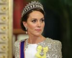
- LONDON, ENGLAND – NOVEMBER 22: Catherine, Princess of Wales during the State Banquet at Buckingham Palace on November 22, 2022 in London, England. This is the first state visit hosted by the UK with King Charles III as monarch, and the first state visit here by a South African leader since 2010.,Image: 739544753, License: Rights-managed, Restrictions: NO UK USE FOR 48 HOURS- Fee Payable Upon reproduction – For queries contact Avalon sales@Avalon.red London +44 20 7421 6000 Los Angeles +1 310 822 0419 Berlin +49 30 76 212 251 Madrid +34 91 533 42 89, Model Release: no, Credit line: Avalon.red / Avalon
-
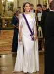
- LONDON, ENGLAND – NOVEMBER 22: Catherine, Princess of Wales during the State Banquet at Buckingham Palace on November 22, 2022 in London, England. This is the first state visit hosted by the UK with King Charles III as monarch, and the first state visit here by a South African leader since 2010.,Image: 739544792, License: Rights-managed, Restrictions: NO UK USE FOR 48 HOURS- Fee Payable Upon reproduction – For queries contact Avalon sales@Avalon.red London +44 20 7421 6000 Los Angeles +1 310 822 0419 Berlin +49 30 76 212 251 Madrid +34 91 533 42 89, Model Release: no, Credit line: Avalon.red / Avalon
-

- LONDON, ENGLAND – NOVEMBER 22: Catherine, Princess of Wales during the State Banquet at Buckingham Palace on November 22, 2022 in London, England. This is the first state visit hosted by the UK with King Charles III as monarch, and the first state visit here by a South African leader since 2010.,Image: 739545133, License: Rights-managed, Restrictions: NO UK USE FOR 48 HOURS- Fee Payable Upon reproduction – For queries contact Avalon sales@Avalon.red London +44 20 7421 6000 Los Angeles +1 310 822 0419 Berlin +49 30 76 212 251 Madrid +34 91 533 42 89, Model Release: no, Credit line: Avalon.red / Avalon


Harpo, who dis woman? It doesn’t look like her.
This is what you get when you order Kate Middleton on Wish
They have done it. They photoshopped a painting. Wtf…
I was thinking Temu.
@Joyful 😂😂😂
I feel bad for the artist because there are no kind words for this “portrait.”
Oh, snap.
@Joyful: exactly my thought when I first saw this. It’s a comment on all the photoshopping! There’s no ‘nod’ to rowing or gardening–and Kate’s not an artist nor did she study art at uni–it’s a nod to photoshop.
Looks like they mixed Kate, Meghan, and Rose in an AI “art” app.
This is what you get when the previous Duchess of Cambridge, current Princess of Wales has had photos and videos of her heavily edited/photoshopped/filtered for years. The majority don’t really know what she looks like.imo
For lack of a better word, this portrait? is an amalgamation of the many faces of Kate that have been put forth out to the public/media. Kind of love it. Especially coming off the heels of major news agencies putting a kill order on KP photos.
Derangers that have edited photos of Meghan to make her look bad and Kate look good, says a lot. The cover represents someone who is a blank slate.imo
Where is Kate?
P.S. Is this image from the same state dinner when Kate matched the lamp in front of her? Lamp cosplay? Sounds right.
I think this is Tatler throwing shade at Kate again
@Denise, bingo! Retribution for the palace making a stink about the last accurate hit piece. They really don’t care what the Windsors think, and it’s glorious.
Yes, and that particular state dinner, when all the Rural Rivals stories were swirling… Tatler didn’t forget.
@Denise – Tatler is definitely throwing shade. The portrait is awful. I wonder if the Turnip Toffs of Norfolk commissioned and sponsored it.
Yeah this is total shade on Kate. That portrait looks nothing like her. So weird. The artist Hannah Uzor doesn’t like Kate at all because the artist is capable of doing an amazing portrait. This is not like her other work at all.
However it gets her exposure for her other work which is much more important. https://hannahuzor.com/long-live-the-queen/
Her other work is amazing.
The Other One, It also doesn’t look like any known Kate Middleton impersonators or Pippa.
At least it’s not as bad as this: https://www.bbc.com/news/articles/cz74ed6yk9lo.amp
Maybe Nanny Maria?
Alack and alas, it doesn’t seem to be a portrait of Nanny Maria either: https://uk.news.yahoo.com/meet-royal-nanny-maria-teresa-201800844.html
The woman in the picture is still a mystery.
@ML – It looks as much like Nanny Maria as it does like Kate.
Oh my God…I never saw this one. What did the artist do Rinehart?? Dagggg.
Thanks for sharing! That story is brilliant and the artist did a great job of painting her soul. Who needs a portrait in your attic when you have an artist that puts it on display in a museum for all the world to see who you truly are. I see he was kind to QEII and King Charles.
It doesn’t look like her at all. It’s a pretty painting of someone with a crown and that is all.
Honestly I think it’s spot-on to her expressionless woodenness. It’s a very accurate painting of a bland woman with nothing to say.
I think that is exactly the point, she is just a reflection of herself, just a blank slate princess, no spark or true inner self to speak of.
@Susan Collins, I don’t even think it’s pretty! Not only does it not look like Kate, I just think it’s really unattractive overall. Ugh.
@Acha and @Lucky, yes I agree with your points. But still…YIKES.
Maybe that is the point – it could be anyone, she does nothing special in her role. Or – nothing is what it looks like, including Kate. The painting looks like a child’s drawing and it has to be intentional, not like the artist cannot paint.
I must admit – artists portraying royals are lately are exceptional, and they are pretty bold at showing their perspective.
That’s exactly what I said! Who IS this woman? It’s not Kate. Did someone paint Queen Mary of Denmark from memory (not from photos because it’s still not it) because it looks more like her than Kate?
Yes! Queen Mary was my first thought as well.
This is the Potato Jesus Princess Kate.
Yes! That’s what immediately came to mind. The botched “fix” of the Jesus fresco.
@Lolab, omg you nailed it! That’s exactly what it looks like 😭
LOL! Exactly my initial thoughts!
Uzor was almost certainly invoking the Monkey Christ effect on purpose lol
Whatever there was of original Kate has been lost under layers of mediocre manipulation.
Man oh man, K is not going to be happy
I was sure this painting was of someone Chinese.
@Ashley, at first glance I too thought “Asian”; one of the prim and proper Japanese princesses.
Yes @Ashely, I thought it very nicely captured the likeness of Jetsun Pema, Queen of Bhutan. She’s a lovely lady.
But as “Kate,” this is not a lovely portrait or even the semblance of a portrait.
Madame, that is Lara Flynn Boyle.
😂😂😂
omg this perfect comment
It’s a portrait of the Stepford Wives robot Kate William is trading her in for.
After so many months out of the public eye, perhaps people have forgotten what Kate looks like.
It looks more like Queen Mary than 🦴, funny how they are putting all these covers out for a woman no one has seen this year. They look suspiciously like memorial covers also which I find creepy. I don’t think these distractions are doing the trick anymore, because people are asking, “where’s Kate?” again. Proof of live by a reputable source should not be that difficult unless she is comatose or had a massive stroke and is not ambulatory or verbal.
Really, it could be a bad portrait of anybody. And whoever the woman might be, the portrait doesn’t capture strength, grace, dignity or the love of motherhood. But, it does capture an empty blandness.
This is not a portrait! There is zero verisimilitude to the person that is supposedly portrayed (apart from the dress and the jewels). This is simply a painting of a generic princess figure.
A portrait doesn’t have to be a perfect likeness but there has to be some portrayal of the person – and here is none. Clearly, Kate never sat for this portrait so the painter has no impression of her as a person. In a sense, this generic princess is the saddest and most pathetic kind of portrait of Kate. An image of a woman who has made her public persona a complete cipher – and thus there is nothing special and particular about her. That is honestly why people don’t really take to her. Kate is all about a perfect image but that also means that there’s no space for authenticity. And people don’t care about “perfect” ciphers, not really. In fact, people only seem to care about her as a racist stick to beat Meghan with.
On the other hand, I think that Jonathan Yeo’s portrait of Charles III is utterly brilliant because it really incorporates a subtle visual critique of the monarchy into an official portrait of the Monarch.
@arthistorian it looks like it was painted by a child, no offence to children. It’s not a portrait.
I will not put down the artist, especially when I am not acquainted the rest of the work. There are many reasons why an artist choose to work in a particular style.
I am saying that this isn’t really a portrait because this is not a depiction of a person but rather of a generic idea of what a princess is: a woman in a fancy gown with jewels and a tiara. I think that there’s a point to this, and that is indeed shady. That Kate is not nothing but a title, an idea of a generic princess because she won’t let the public see anything else. So how do you portray a person like that? With a picture that really could be any woman in gown and tiara – and then it is really no longer a portrait. It is a “portrait” that says that there is no There there. Nothing but an empty gown, topped by a tiara made famous by another woman.
@ArtHistorian You said this perfectly. Exactly what I wanted to say. It’s generic and I do think it’s certainly shady as well. And could you imagine having to paint Kate her thousands of the same robot, mannequin poses.
Art Historian, you really nailed it. This is exactly what Kate has given to the world, a generic blandness devoid of anything interesting. Her obituary is going to be a paragraph.
Maybe this is to prepare us for the stepford wife that will replace her. They’re hoping we won’t notice the difference. I hate that I even think this.
This was my first thought, this is what ‘Kate’ will look like when she is finally seen again.
What on God’s green earth is happening with the royal family?! This painting is bad, right????
I do really like the blue-green background color. I’d love to have that on a wall.
The blue in the left half of the portrait is the shade of Big Blue, which I definitely think was an intentional choice by Uzor.
The Fortune 100 company I work for just got a new PowerPoint template. The background looks just like this background.
(And that face looks kind of like those generic Microsoft Teams avatars.)
Synergy – or – CONSPIRACY?????
@Josephine, LMAO, the background *is* a pretty color. It’s sad when that’s the best thing we can find to say about a portrait of a person, though!
The background is pretty, but Kate herself – just awful. She looks nothing like that. NOTHING.
What is going on over there? What made someone at Tatler decide, you know what would be a good idea? To commission a portrait of Kate and have a story about how perfect she is??
If the issue is about royal portraiture, where is Tatler’s portrait of William? It’s very interesting they didn’t bother with him. I read yesterday that this was commissioned recently, (I wish I could find the source to check the facts), in the midst of the whole Kate Is Missing controversy. Feels like those aristos at Tatler are stirring the pot a little here.
It is AWFUL. Not only that it doesn’t look like her (which is falling at the first hurdle for a portrait) but it’s just a clumsy, amateur painting. It looks like the kind of thing you would see on the wall of a school art class for GCSE art. And if it was a GCSE exam submission I’d still only give it a C-
ETA there are many reasons to hate the latest ‘red’ portrait of Charles but at least it looks like it’s been created by a professional artist.
ETA this would only make sense to me if you told me that there had been a competition amongst primary age schookids to do a portrait of Kate for Tatler and this was the winning entry.
Yes, this was literally my first thought, to be kind to the artist because they are a child. Then I went to look at some of the artists other work, and I can only believe, strongly, that this manner of portraying Kate is purposeful. If you look at other paintings, for example, one titled “the age of innocence” and one of Sarah Forbes Bonetta, you see the same theme of the white dress and the hands clasped in front, but the other two paintings are of fully realized subjects. I think the artist is telling us that Kate is flat and empty, that there is no there there.
@Chaine ITA. This artist is capable of a nuanced, insightful portrait, but chose to do Kate’s portrait this way: like a child’s painting of a princess.
I also think the slight defensive hunch to the shoulders is deliberate, and that even a talented child couldn’t have done that.
She’s been unseen for so long no one can recall exactly what she looks like
And portraits like this? A misguided attempt to get us to get fuzzy on what she actually looks like? It’ll make it just that much easier to pass off fake-Kates and AI-Kates going forward.
I’m just being silly of course, no one would *actually* do that.
Then again I used to think it was silly to wonder if Charles/The Firm/the men in grey had Diana killed. And now it seems entirely in their playbook given all the ish they pulled on the Sussexes from almost the get-go.
Maybe its the new face she got?
Ooh, I love this as a theory, Tatler soft launching the new face. So, if Kate rolls out soon with a nose job, fillers, and a tan, we’ll know what’s up.
This was my thought too. After whatever has happened to her, this is what she looks like now. Since no one has seen her, no one can question it.
I low key like this portrait. I think it’s wooden, flat, one-dimensional, and unrecognizable all on purpose. This artist is otherwise quite good. This is all on purpose.
Makes sense. It’s unlikely the folks at Tatler don’t have eyes.
Yeah I looked up her other work and the artist doesn’t have to paint like this. She definitely chose to.
Agreed. The figure is very closed off, a cypher. And with the white dress, she becomes a blank screen that we can project our own images on. I think it captures Kate perfectly.
Yeah, after looking at her other work, I am fully with you. She’s making a statement about Kate.
To me this looks like it’s pointing out how bland and replaceable Waity is. This portrait could be any woman because Kate leaves no impression or mark.
This.
Everyone should look at Hannah Uzor’s work and decide if they think this was on purpose or a lack of skill. Uzor is quite capable. I happen to think the “badness” is part of the painting.
I finally did & you’re right. She’s a very talented artist. This was a choice.
@Snaggletooth, agreed, which makes the fact that Tatler chose to run with it the interesting part of it to me. They knew the reaction it would get.
That:s what I thought when I first saw the cover. That’s not Kate. It:s a generic portrait showing nothing impressionable about the subject. I was wondering if the artist was trolling her.
Exactly! This could be any white woman with brown hair.
All these theories about the artist making a subtle statement about how bland and blank Kate is are interesting BUT her statement is very sycophantic about Kate
They can point to nothing she has actually achieved outside of having a few hobbies like everyone else on earth. As for dignity, how about a few portraits where she flashes everyone.
It just feels… pointed? misguided?! to release a portrait of what looks like a bad Kate Middleton look-a-like at the exact time there are accusations of using look-a-likes lol. They’re not beating the AI allegations any time soon.
I went to the artists website. She has a series of portraits of black victims of racially motivated killings during Elizabeth’s reign. I wonder…
Yes, once you place this amongst the artist’s other work it’s fine. Hannah Uzor is Zambian. I’m happy they used an African artist to paint a royal racist.
Kate doesn’t look flattering in this portrait at all. Pretty much the opposite of what they’re saying she is. I think they’re both throwing shade at Kate, Tatler and Artist.
Hmm, yes, commissioning a Zambian artist for a portrait of Kate the Racist. Interesting choice.
It is really strange at this particular point in time.
I’m always happy for an artist to get a commission, but it’s like Tatler is drawing attention to the fact that they knew for some time that they couldn’t expect to get ANY current photo of Kate for their July cover. And they absolutely knew they’d get attention for this.
Everything about publishing an awkward, “bad,” painting of Kate at this moment is highly provocative. Meanwhile the DM still runs old, glossy pics of Kate when they bother to write about her at all. Tatler is not the DM. As we well know here, Tatler is fully capable of coming for Kate
@Lizzie, good point! I hadn’t thought of it that way, but you’re right. It absolutely draws attention to the fact that no one knows when (or if!) we’ll see an actual, new photo of Kate again.
The hardest thing she had to do was to walk with H&M after the Queen died. It seems, Tatler has a funny idea what the strength is.
This has to be an internet prank. There is no way Kate would approve of such a distorted portrait of her. It looks nothing like her. I hope the artist did not get paid. The woman in the portrait has rosacea?
It was commissioned by Tatler, not the RF. I don’t think Kate would get any approval.
It looks like a twelve year old painted it in art class and then her mum stuck it on the refrigerator. Definitely giving effigy vibes.
It’s also flat and lifeless. Lay that figure in a horizontal position with her hands crossed over her chest and it does resemble an effigy. Is there a message here?
@Agnes, IMO it’s worse than that! If my kid did a picture of me and it came out like this, at least I’d know it wasn’t intentional and I’d stick it up on the refrigerator without taking offense. I’d know that it was done with love and that art simply isn’t one of my child’s talents, lol. But in this case, many adults signed off on sending this to print as the cover. Yikes.
@Lorelei, yes it’s mean-spirited. The artist is talented, and amply capable of more than 2-D primitivism, as said elsewhere here. It’s an intentional diss.
Thought it was Queen Mary at first glance. Which makes sense given Kate’s copying of her.
Ditto when I saw it yesterday.
Just a reminder that your “flaws” are what makes you recognizable. With Kate, including the asymmetry of her eyes and eyebrows along with a smile showing a bit of her dimples would make a world of difference in making this look like her.
Agreed. Everything is off on this portrait. Kate has downsloping eyes, a bigger nose that she’s already had a nose job on, her jawline is square, and she has no lips (she’s been getting them filled for years but they’ve never been this big).
It actually looks like Farm Shoppe “Kate” more than it does KM.
I noticed those details as well. But Farm Shoppe Kate was so much livelier — this is more like rental car Carole Kate.
The Weekend a Bernie’s princess
“ A portrait of Strength and dignity” 🤣 – stop trying to make fetch happen.
That portrait looks more like Michelle Dockery than KM.
I mentally said exactly the same thing!
Lmao! Who is this woman? Because it sure ain’t Kkkhate Missington. I’m sorry to this artist but this is not a good depiction – either in resemblance or in the sentiment. Fake Meddlington looks lost, unsure and withdrawing within herself rather than strong or dignified.
@Macheath, you’ve just described the way that I see Kate — Fake. Lost. Unsure. I don’t see her as being strong or dignified at all. I see her trying to smile, trying to be “a princess”: Stuck, uncertain, and ineffectual. I think the artist captured something genuine: Kate the unsteady cipher.
I think Uzor has painted what’s really there.
What a beautiful picture! Do we know which of her children has painted it?
I cackled!
😄😆
Please go look at Hannah Uzor’s oeuvre on her personal website. Her work is amazing. I think there is much bigger hidden message here.
Tatler is totally being shady. I laughed so hard when I saw this. I do feel bad for the artist as she is talented but i think she was used badly here. And yes it’s a society mag using a black woman for cover which is extra gross. The Kate stans are all mad at the artist when honestly be mad at Tatler. You can read between the lines they don’t like Kate.
Also Hannah Uzor is saying something as well. She has more skill and talent. She couldn’t be arsed, which I think is also a statement.
I def think Tatler is being shady but what really bugs me is the nose. Is shorter and fuller than Kate’s. What is the artist saying??
Agreed.
@easternviolet absolutely good point. She is making a statement through her work.
An artist as renowned and talented as Hannah Uzor would just turn down a commission if she didn’t want to do it. No way would she just “phone it in”. She’s an amazing artist, the painting is excellent and it conveys a lot… (even it it doesn’t look like Kate.
Thank you for suggesting checking Hannah’s website, her work is amazing.
So what has she captured here? A bland face with slightly scared eyes is my spontaneous answer.
If it’s based on the photos shown, KM looks better in the portrait as the photos seem red-eyed as though she’s been crying. Also looks like she’s wearing contact lenses in the photos.
I am also seeing an artist who is intentionally not giving much effort to represent her likeness.. which is so deep to me. This is my new favourite portrait of Kate.
I mean portrait painting is not taking a picture – of course it’s always a little bit off, in this case really off. But what I find interesting is that Uzor has captured a kind of defensiveness in her posture but the face is almost infantalized to me. Like Kate is still a child in some respects and can’t fully own the life she has found herself in.
Yeah, I feel like the childish style and defensively hunched shoulders are unmistakably purposeful, from an artist of Uzor’s calibre. Uzor and Tatler are throwing shade.
Agree. My take: If you look only at the left half or right half of Kate’s face, each half looks more like her photos, which leads to the impression that she’s two-faced. The shy “smile” she has is actually a good rendition of Kate’s pursed lips in the original state dinner photo. The artificial fatness of her cheeks, meant to make her look younger, just reminds me she uses fillers, and her dead eyes show her inner lifelessness and cruelty. The childish style is a comment on the press constantly infantilizing her, but also brings to mind that her biggest “project” is her Early Years bs. There’s subtle off-white/light yellow stripes in her white dress, which makes me think of Kate wearing white at Meghan’s wedding. I think even the blue background is intentional—Kate trying to fit in with the “blue blood” aristos, but one half is thin and not truly blue with a green underlayer, like green with envy.
Yes! There is an intentional flatness – almost a superficiality and no personality underneath. Empty eyes, a blank stare. The more I think about it there is — its not a naïve painting. It is saying so much about artist and subject
I love this analysis.
Yes @fifty-50 I intuitively saw a lot of what you have described so well. There’s a lot more to this portrait once you look at it and makes quite the statement at this moment.
Add to that the lack of depth and dimensionality…I think it’s not really a stretch to say that Kate as portrayed in the media is more a rough sketch of the idea of a Princess of Wales/Future Queen. No depth, no detail.
It’s also got a lot of easy details quite wrong, (the sash and star, the shoulders of the dress, the bracelet is entirely missing) but the biggest one looks like an intentional alteration of the tiara.
She wore the Queen Mary’s Lover’s Knot tiara, a tiara that QEII’s grandmother Queen Mary commissioned to copy the then-Duchess of Cambridge’s Lover’s Knot Tiara (which no longer exists)…it honestly looks like the painter completely removed the lover’s knots from the Queen Mary’s Lover’s Knots Tiara?
From a distance it looks normal but when you zoom in the lack of the lover’s knots is rather glaring, and makes the dangly bits free-floating. Paint!Kate is essentially wearing an impossible tiara.
Paper doll princess.
I believe Hilary Mantel was roundly scolded for pointing out that Kate’s role was not much more than being a capable clothes hanger
Yes, compare this one to “Kate’s” : http://www.hannahuzor.com/wp-content/uploads/2021/03/Hannah-Uzor-Sara-Forbes-Bonetta-submitted.jpg
She is throwing shade.
Mygawd look at the detail. The artist cares more about the textures of chiffon than the accuracy of Kate’s face. 🤣
When you look at the photo on which this portrait is based, you realize it’s an almost perfect likeness. Uzor is capable of painting near photo-realistic portraits. I think this is how you say eff this colonizer, kopypasting, keen, foot-soldier-for-the-patriarchy, mean girl beyotch in painting form.
There is definitely a message here from the artist – and it is not complimentary to Kate! Totally shade.
@Snaggletooth— your words “at this moment” explain why I think I feel so strongly about this, why I dislike it *so* much.
Because while we don’t know exactly what’s going on with Kate right now, we know she’s going through something pretty bad, and to release this right now seems tasteless on Tatler’s part, imo, like a pile-on when Kate’s already dealing with enough.
I get that an unflattering magazine cover isn’t her (or anyone’s) biggest problem, it just seems like a very mean Choice by Tatler to publish this right now, knowing the reaction it would get.
I’m no fan of Kate’s, but it’s clear that something is very wrong in her life at the moment, so putting this out there right now just seems unnecessarily cruel, imo.
@Agnes, that one is *stunning*!
Lorelei: I do agree with you. Granted, don’t like Kate and I think I agree with the intended message of this painting (if I understand it correctly). But she is either sick or has had something violent happened to her. I do not believe the facelift theory at all. Something bad happened and there’s a reason that feminists are the ones demanding answers the loudest right now—an extremely famous woman has disappeared off the face of the earth and we’ve all been scolded for asking questions.
Frankly, William is the real villain here and I’d like to see what an anti-colonialist artist could do with his portrait. Charles-as-satan was however completely deserved, cancer or no.
@Loreli
I agree that it is a bit mean spirited – but that is Tatler and its audience, mean snobs.
If the Scream painting was of a princess…
😂😂😂
Maybe famous people should give up on portraits. These re-imaginings are terrible. I hated the Michelle Obama one, C-Rex’ was the stuff of nightmares, and this one of Special K is cartoonish. Is Tatler trolling Kate and/or the RF?
And what in the word association hell/new Jeopardy is this? Love of gardening? Makes me think of garden tools and rose bushes. Rowing? Boats or yachts. I could be wrong but has gardening or rowing ever been noted as K’s hobbies before now? I thought her hobbies were chasing and landing W and mean girling potential rivals. But this? What is happening?!?!?!
I absolutely love Amy Sherald’s Michelle Obama portrait.
And now that I’ve seen Hannah Uzor’s website, I totally agree with the other commenters who are saying that this is a statement by this artist. It’s not meant to be a photograph.
The unsmiling expression. The hands at her stomach. The flatness of her expression.
She rowed, briefly, as part of a dragon-boat team that was going to cross the Channel for charity, but she dropped out when William called her back. That’s the only ‘rowing’ she’s done. As for gardening, they’ve told us this but I’ve always figured it goes along with the ‘Kate loves the outdoors!’ stuff they’ve been feeding us.
Almost every portrait artist who does any painting for the royals will be criticised no matter what but for Kate!?!?! Unless it’s ridiculously flattering, makes her look 20 years younger with slimmer nose, and somehow likeable, there would be a huge backlash. Especially when the artist is black.
It’s the round chin, non defined cheek bones, and the left eye (when looking at the image) that ruin this portrait. The mismatched eyes are the biggest culprit for ruining the whole thing. I feel kinda bad for Kate because this far the portraits of her have been awful for one reason or another and let’s not forget the wax figures of her and William. People don’t like her enough to do a good job.
It looks like Rose.
Maybe it Kate’s “new” face….after her last one got “rearranged”.
Multiple reconstructive surgeries take Months to heal.
It’s not bad. It just doesn’t look like Kate and Tatler was trying something here getting a black woman to paint this portrait. This woman was wrong to accept it given Kate’s history.
She wasn’t wrong to accept the commission if the object were to paint an effigy of Kate, not her actual likeness. As mentioned above, the woman is very talented, so the flatness is intentional.
Yep. There’s a reason why a talented artist like this chooses to work in this style for this particular subject.
Perhaps it says something about what a black woman thinks about the relationship between Kate and Meghan. Cold
Bahaha, highlighting her passions with the blue and green background. The artist forgot to mention her early years projects are represented by the shiny dangling bits on her dress because babies like shiny objects 🤣
This painting is hilariously (intentionally?) bad and just goes to remind us that Keen only had the one official portrait done before she’s being shuffled off to first wife status.
What is the Willy and Kate joint portrait they had done? I don’t remember any official painting of the two of them. I saw something the other day on twitter but I’m pretty sure it was just made up fanfic.
The portrait: https://www.usatoday.com/entertainment/
Ok this portrait is hilarious but let’s look at the data-
Tatler (no friend of Kate M) commissioned a black artist whose work is activism to paint the Great White Keen.
And she turned in this piece of work at this time in the cycle of PR shenanigans.
This was no accident. I def think Hannah has plausible deniability but she said oh you’ want me to paint the future Kkkween? The one who stepped to a black woman on camera!? Sure here ya go!
Hahahahaha I am laughing so hard at this. Because tatler would have had a kill fee in the contract w the artist and didn’t use it. Kate is not even thin in this depiction!? Or sparkly or recognizable. I LOVE this for her. It’s masterful shade.
She seems immune to being depicted in any way that might be pleasing to the eye.
#Kate who?
I actually love it. It’s not an exact photographic representation like her other portrait but it really captures her pinched snobbishness and insecure and inelegant stance, regardless of the gown and jewels.
I’m honestly not being sarcastic when I say the artist did a great job here, in my eyes. Well played, Tatler, absolutely bold move to commission a portrait of her in her “absence” and highlight a black artist rather than just using a year-old pic. Love it.
between that awful diana sculpture, the red scare portrait of charles, and now this … are there no decent artists in the UK?
serious question.
The red portrait of Charles is brilliant – once you realize that the artist most likely never intended to flatter the Monarch. Read up on Jonathan Yeo – and compare the painting of Charles with his other portraits. There’s a subtle message in the way the red dominates the image and almost consumes the Monarch, the man embodying a millennia old institution soaked in blood and colonialism to a degree that he almost disappears in this red haze. The current King is in a way depicted as a nonentity caught in the red mist of all the blood that institution that he currently embodies has been complicit in. A lot of people are catching on to the implicit critique, even without an artistic education. Yeo has to be subtle and diplomatic because he still needs to work but these paintings are also his artistic and historical legacy. I think he’s absolutely brilliant – and Charles very likely doesn’t get it at all but is congratulating himself of choosing a non-conventional portraitist.
What surprised me about Yeo’s portrait of Charles is that it appears astonishingly sympathetic to Charles as an individual. Yeo makes him look both trapped as a person (the sheer character imbued in his face), yet complicit as monarch (his hands holding the sword). Figurehead of the UK government, but also the absolute embodiment of the UK’s history. The two poles of his hands and face feel like an allusion to Charles presenting the image of a neutral, apolitical royal, yet behind the scenes he’s been accepting money and interfering with governance – a statement of “don’t look at what my hands do.” The size of the canvas must be a factor too – I can only imagine how it must loom over you as you look up at it, but from a distance his expression makes him seem approachable. Ultimately I end up feeling this reluctant pity/disgust/disdain for him without absolving him of anything – which at the end of the day epitomizes everything about Charles.
I totally agree. It really shows how good an artist Yeo is. Check out his portrait of artist Damien Hirst, who is famously a huge asshole who has made his name (and money) doing stunt art. That portrait perfectly captures its subject as well.
Ha! They really want her to be Queen Maxima soooooo bad. That painting doesn’t look like Kate to me but her whole styling in the picture they based the painting on is Queen Maxima’s whole inauguration look…hair in a chignon, cape dress and similar shaped crown.
Are there any photos of KM with Maxima? Maxima is stunning, impossible to take a bad photo of her, plus she’s got the height.
It was a lovely dress but that yellow ribbon behind the medal spoils the look. The other awards don’t enhance it either.
I didn’t even know Kate had a love for gardening? But okay, maybe the woman in this portrait does like gardening. Bc the woman in the portrait is not Kate. The dress and cape are the only thing that identify this as Kate. Which works? Bc she’s basically only known for her clothes. Hanger of clothes indeed. The face just does not look like Kate.
She has a love for Agas. Maybe the artist should have painted one hovering above her shoulder.
Y’know, I think the artist got one thing right…the haughtiness of Kate’s mouth. She definitely has RBF if she doesn’t consciously fight it.
😂 Tatler and Hannah are trolling her. This is too funny.
Hate it! Throw it in the trash. It looks absolutely nothing like her.
I mean, she wouldn’t be the first portrait artist to troll their subject through a …creatively revealing portrait – the proud King of England, enveloped in the blood that bought him the throne, for example. “A Portrait of Strength & Dignity” and there’s Kate, in all the trappings of royalty, but instead of strength and dignity it’s giving smug self-satisfaction with an undercurrent of insecurity. The sad plain sash highlighting how few honors she’s actually earned, the poorly blended concealer immortalized for eternity. Kate may be royalty but Tatler has trolls of the highest order.
The name—A Portrait of Strength and Dignity—makes me think of everything the press and KP constantly tell us that Kate is the bedrock of the monarchy, Kate is strong in the face of adversity, etc etc. But no matter how many times you say it, that doesn’t make it true, and you can’t deny the evidence that’s right in front of your eyes.
At the same time, it IS a portrait, which makes you wonder “what is it a portrait actually of? What kind of strength and dignity is represented?” Well, it’s literally a depiction of the British monarchy, and therefore the monarchy’s strength and dignity—a depiction that by anyone’s standards falls short. But who did embody the “strength and dignity” of the UK? QEII, and it just makes you think of how this is the future queen of the UK and how she just doesn’t measure up.
It is a portrait of a generic princess figure with no particular identity. And does this not perfectly encapsulate what Kate has made of her public persona – a “perfect” cipher with as much personality and authenticity as a cardboard cutout.
It feels like a visual callback to Hillary Mantel’s words about Kate.
If Kate were strong she would be out and about even if all her hair has dropped out.
@Jais – YES – such a good point! It really does.
I love a good trolling as much as the next person, but the description makes it sound like the person who painted this was serious. It’s hard to make fun of something, that someone is proud of doing – Now if all of those words are actually sarcasm – then that ticks the boxes. I honestly at first glance, thought a grade schooler did it for a school project , and good on them, the features are there – just not in any way connecting to Kate. If it’s meant as outsider type art , it also works, I’m just trying to understand the the thought process. Also, why is the Tatler commissioning portraits? AI media prints, sure. Portraits?
My very first thought when seeing this portrait, didn’t read the caption, was that it was a portrait of Meghan. The face looks more like Meghan than Kate, the eyes, the nose, the full lips are much more like Meghan’s features than Kate’s. What is Tatler doing here? Trying to superimpose Kate over Meghan? If so, it’s never going to work, one can’t superimpose mutton over lamb, mutton will always be recognized as mutton.
Tbh, I thought it looked like Meghan from a distance too, especially with the skin tone. But when you look at it closely, you see that it’s Kate. So I think back to when Meghan first entered the Notfamily, everyone talked about how it was a new day for the royals and how they would look so modern and inclusive but at the end of the day, you see nothing changed at all. Still the same line up. So I think this was a deliberate message from the artist.
This portrait looks more like Queen Letizia. Perhaps he grabbed the wrong pile of photos.
Oh riiight, Minka Kelly. I was thinking I have seen that person before, but who was it? Not K4te. But right, Minka Kelly.
Btw, “the portrait” has already gone viral. 😀
The Tatler commissioned 3 covers for the month: QEII, Charles, Kate. Tantrum from Will incoming?
https://www.tatler.com/gallery/the-queen-the-king-and-the-princess-tatlers-july-2024-cover-completes-a-royal-triptych-of-historic-magnitude
No portrait of Crocmilla, the Kween? Now that should definitely provoke a tantrum, lol.
No elegance grace or dignity. I think of her taki ng threatening steps towards Meghan and glaring.
It reads like ‘in memoriam’ to me.
Here in the US, all of a sudden there are all of these tribute magazines featuring Kate at the grocery store. One was put out by Town and Country, then the other day I saw a different one. Big picture of Kate with a black background. Like when QEII died or if there is a big event or anniversary. I thought it was really odd and creepy, but I thought maybe KP commissioned a bunch of magazines for PR. Now this Tatler one in the UK. What’s going on, it’s not like any big event is happening with Kate, no one has seen her in months? Weird.
@MSIAM I saw and thought the same thing. People Mag also put one out with her on the cover. Kp definitely commissioned them. This is getting so freaking weird.
Which magazine had her shopping or with the black background?
@ Julianna I think MsI is referring to supermarkets have all the gossips rags, etc on display at every shopping checkout line.
I saw this on TikTok last night. There is a lady, matta_of_fact is her account, that she analizes royal reportin and gossip and such. She also has an art degree, so she tried to explain kind of what this portrait means. Her theory is that this IS supposed to not look like Kate, because at the end of the day she is a blank slate, nobody knows who she really is and that is by design. She is a blank slate that people are supposed to project on to her whatever their view of her is. It was a very thoughtful take, she explained it much more eloquently that I just did. It’s worth checking out.
Also, I get that Kate Middleton isn’t really liked on this website, I don’t really care for her either. But it’s rude to criticize someone’s hard work, which they obviously took seriously, saying that it looks like a grade school student drew it. Art is subjective, so you’re allowed to feel however you want when seeing a painting/portrait without being disrespectful to the artist.
LOL. Just no!
Ha ha! As if she hasn’t got enough on her plate, they go and do this. Poor woman.
When I disregard the fact that the facial features don’t really capture the familiar Kate that we all know, I think the portrait is actually an excellent representation of a royal woman.
Hate it! But love the fact that Tatler is obviously trolling Kkkhate. The Black artist knew exactly what she was doing. Kkkhate looks insignificant and insecure and not at all regal. She looks out of place, like the clothes and jewels are wearing her. She seems unsure of herself. Perfect for the Royal Racist.
You’ve summed up why this is now my favorite royal portrait of all time. It tells you everything Kate has put out in the world.
So Chuck’s portrait was literally his ritual meeting with the devil and Kate’s is an effort from the local paint and sip ?
This portrait is getting dragged on SM right now. Howling.
I think the point of the portrait from Tatler’s standpoint is to show that the job and title Princess of Wales can be held by anyone and that Kate isn’t as beloved as we’ve been led to believe. I don’t think those at Tatler like her much at all and are showing her that she is replaceable.
For all that I didn’t find Charles’s portrait to my taste, it was at least very clearly him in it. Who tf even is this woman?
I think that is kind of the point! Who is this woman? Who knows because Kate has made her public persona into a complete cipher with no kind of authentic personality. Generic princess cutout is the result.
Very much so. Now being depicted as an empty headed automaton. The rf are ruthlessly phasing her out.
Which they did to Diana (too much star power), Meghan (too charismatic and has to be said Kate joined in) and now Kate herself, Queen of bland.
Completely agree. The only ways to identify her are the dress, the ring, and the ribbon. One of the first things I looked for when I saw the portrait was Diana’s ring and I thought “yeah, I guess it must be a portrait of Kate.”
The ring is what convinced me. That is just a damning statement on who she is.
@Fifte-50,
You are completely correct. This is a damning statement on who Kate is – and I think it was 100% intentional on the part of the artist.
Kate didn’t sit for this portrait, bc of course she didn’t: Kate has been incommunicado for six months, and the artist is African.
So no wonder the portrait doesn’t capture Kate’ humanity–the artist Tatler commissioned had no interaction with her. The woman in the pic looks like a generic princess, but with shoulders hunched defensively. I think the artist did that on purpose–I find it thoughtful, and telling.
The fact that this is all based on photos also raises the question – if Kate did commission a portrait, would she ever consider condescend to sit for a British-Zambian painter? No, absolutely would not.
Also, of all the dresses and all the state dinners, Uzor chose the one of Kate at the state dinner for the South African president. There are so many layers to this painting.
So many layers!
I’m guessing one reason Uzor got the commission is that she’s made wonderful, humane, insightful portraits from photos before, e.g. her portrait of Aina, Queen Victoria’s goddaughter, later known as Sarah Forbes Bonetta Davies.
So glad to have been introduced to Uzor’s work by this Tatler cover art.
I find it hilariously bad. She looks very matronly. Old Tatler, they know what they’re up to! Then again, I didn’t like the KC portrait everyone was raving about. Looked like the late Geoffrey Palmer to me. The Jamie Coreth, which had a Singer Sargent feel to me, is probably the one she likes the most.
It looks as much as a portrait of young Masako, the Japanese Empress as it does Kate.
Right. Exactly. I kept looking and looking, but there is no “strong Western Woman” here. From the colors, the body language, the way the hands are being held – totally Japanese formality. Intentionally? But… why?
Yes, I was going to post something similar. This could be a painting of any of the princesses in the Japanese imperial family. I was especially thinking of crown princess Akishino.
That was my first thought as well.
Didn’t she disappear or drop out, or was disappeared?
Wow – at first glance I thought it was Pippa. Its like that other painting of her, unrecognisable.
lol , they trolling her again. They know damn well this looks nothing like her. But in true British form they present it to remind the public how bland she is and that no one really knows Kate’s face 😂
I’m sorry, a portrait of WHO exactly? Cause that looks like Kate’s gown & her little participation award sashes but that is NOT her face
I know. The thing is, of course, portraits are difficult. They need to be recognisable enough but also capable of bringing in the individual artist’s take; the best have something new to say about the sitter that was always there yet slightly unnoticed. I see a rather matronly woman, hard yet timid at the same time. I tell you what the artist has captured – her hunch and the way she holds her hands in front of her. I always wondered what the late queen thought of Freud’s picture. All things told, nothing will be as poor as disgusting Rolf Harris’ picture of Elizabeth. Someone said, the teeth followed you wherever you were standing in the room!
Yes, and that particular state dinner, when all the Rural Rivals stories were swirling… Tatler didn’t forget. Prince William Rage incoming…
I’m don’t think I’ve seen anyone comment on this yet but I’m getting serious chills on this. QE11-deceased. Charles and Kate (both ill). Where are the other royals? Why just these 3? What is going on in the uk????
I don’t know, but my first thought reading your comment was that bad things happen to people who get in Camilla’s way. My second thought, though, is that these three people live in places that, by my standards, are quite old. Maybe it’s something in the water. Or the pipes. Or the ventilation systems. Maybe their crystal clear water source is contaminated — and no one’s thought to check. I’m serious. I can’t imagine any of the three scarfing down junk food, surrounding themselves with plastic, or even foregoing regular exercise. Maybe some factor in their common environments is quite unhealthy. Something similar to pewter poisoning or lead leaching from crystal — that most people wouldn’t be as exposed to.
Wow Blithe! I never even thought about that!! That is such an interesting thought. Those palaces are old. Lead pipes maybe? I mean for Charles it could just be age. And genetics plays a part too sadly. But that is such an interesting theory!
Agree. Good thought!
Kate is no longer of interest in the story, she has done her duty, the heir and a couple of spares, they don’t need her any longer.
Why did the artist make her look like a ferret? It’s terrible. The headline is cracking me up though, hiding is not quiet strength and dignity. Let them keep trying though. All they’re doing is making people want to ask a question…..
Did the Tatler get tired of taking orders and decided to turn the table?
Art is subjective, but she looks like a corpse here.
I looked at the artists site. (Love her work). My opinion: this is intentional. My thought was that her eyes are squinting, as if this is the real expression that she has on her face when she sees people she disapproves of. Perhaps people of color in her mileu (sp?) I am seeing white lady / disapproval/ racist micro expression here. Tell me Im wrong!
Hate it.
From a distance it doesn’t look like Kate but close up, it does look like her. The painting has that pinched expression that Kate has when she’s not fake laughing about something. I think the artist captured Kate perfectly, from a distance she looks soft and benign but up close, she’s cold and disapproving. Exactly like Harry described her in Spare.
Is this preparing us for what ‘Kate’ will look like when she ‘returns’?
I’ll say it. What’s the big deal? It’s not an official portrait of Kate commissioned for the National Gallery. It’s a generic rendering for a tabloid. A tabloid who has already thrown shade at Waity in the past. Kate is just a figure. No one knows her. No one seems to care about her beyond the title of Princess of Wales. And even gaining that title hasn’t done more to elevate her stature in people’s mind. She’s just a cog in the wheel. She’s not physically present but it doesn’t matter because the monarchy and her marriage continues without her presence. So why produce an exact portrait of Kate when another generic brunette could easily replace her?
Exactly. This painting is generic. @Arthistorian described it well too. Kate is empty and this painting represents how easily she could be replaced.
Maybe she had a Princess of Wales Barbie doll, and she was painting that.
Looks like a doll or wax figure.
When I saw the painting, my first thought was “what a beautiful portrait of Empress Masako of Japan!”
Nobody looks to Kate for anything, why on earth would they?
Well, the artist got her fakakta eyebrows correct, that’s all I can say.
Could be anybody or nobody. Doesn’t look anything like Kate and as it doesn’t look anything like her, how can it represent all the things that are claimed.
Well.. truly a remarkably unflattering portrait. Although I kind of agree with the squinty eyes and pursed mouth!
How in the world does Tatler have portraits of 3 of the 4 senior royals? Where is egg’s portrait?
I think the artist did Kate a big favor, she has been given a prettier look, IMHO. I think it’s the best portrait of Kate so far.
I think it looks like the look a like from the TMZ video
I like this work by this talented artist. The dress, the beautiful arm and hand placement is lovely. I think it’s wise not to attempt a portrait type painting. The theme is strength and dignity and she used the blank slate of her face to portray that. Everyone sees art with individual eyes and tastes. I appreciate other opinions but we can have our own, as well.
So an accomplished black female artist has been asked by Tatler to paint a portrait of the snow white princess. The artist has produced a compelling and insightful portrait of Kate, but it is hated by numerous loud voices , and Tatler, who gives masterclasses on throwing shade must be happy with the portrait and what it seems to say about Kate, is letting the artist take the flack- a two-year old could have done it, throw it in the bin, doesn’t look like Kate at all, flat and amateurish, etc, etc, etc. “Strength, grace, and dignity” would be what we hope a princess would embody, but do we see it here in this portrait? The smug expression, or pursed lips, or smirk, however you may choose to see it, says it all about this princess.
I mean at this point they HAVE to be trolling the RF.
This is perfect. She painted Kate for the shallow, cold nothingburger she is. Portraiture like this tells the real story.
Well put
The hardest thing for most here is thinking outside European/U.S. standards. We think verisimilitude is the goal yet somehow we esteem Van Gogh’s wild swirling skies or Picasso’s mashed women. I love the dress here far more than the original, it’s impossibly tall with richer colors than Kate’s actual dress. Those cherished jewels are now tiny.
Reminds me of Aretha’s opinion when asked about Taylor Swift. “Nice dresses.”
This portrait looks like it was done by the same artist who illustrated The Bench.
No it doesn’t. It’s not his style at all.
This is in keeping with the other “portraits” we have “seen” of her since she went missing. The photos and video were not Kate, and this looks like a portrait of a stand in; somebody else.
At any rate, it’s a bad painting. Can’t understand why they didn’t use the photo from that event instead, unless there is shade there, and/or hidden meaning. Awful portrait.
I looks like Kate would look without makeup, if Kate’s looks weren’t all makeup.
I don’t understand why Tatler took it upon itself to commission a portrait, but there it is. It’s ok but it makes her look doll-like. Stare is sort of blank, limbs stiff, like the Hilary Mantle description of Kate. Her fans aren’t happy, they’ve attacked the artist with racist comments. Of course the vile Sarah Vine had to mention Meghan when criticizing it. Anyway will get people talking about her again.
I thought by the summary photo that it was painted by the same artist that did Gina Rineharts! Haaa haaa.
Horrible. Absolutely horrible. I even prefer the Bloody Charles portrait to this, as it actually underscored his real character. I don’t even know what the Kate “portrait” is supposed to be. It’s like a bad New Yorker caricature of someone. It bears no resemblance to the real Kate. Just why?
It occurs to me that they are already erasing Kate with that child-like picture of her. Soon no one will even remember what she looked like. Chilling.
I didn’t like it at first. Now it’s growing on me. Kate’s photos are so glossy and epnhanced that the slightly dreamy quality of this painting makes me want to keep looking.
I’ve seen a lot of photos and videos of Kate and she usually looks quite rigid. This painting gives a softer focus to her. Almost like cracking a hard shell to see the soft center. Her arms in particular are much more relaxed than usual.
As for her face at first it looked nothing like her. Now the longer I look it seems to contain small elements of her face that draw attention. I don’t have a background in art but this really draws my eye.
As for Charles’s picture it’s brilliant. It flatters him and makes him seem stronger but it’s a very interesting break with tradition. I love the red.
Geez, all these indepth discussions about this painting makes me a little embarrassed at my first reaction, which was ‘huh, an impressionist interpretation of the artist expressing her impression of the subject as a whole.’ which is kind of convoluted in its own way. Honestly, I’m impressed! I like the lazy background strokes, I like the colours just because blue and green are my favourites and the poem learnt as a youngster “blue and green should never be seen except upon an Irish Queen” (I have no idea where the saying originated, but am sure I did not make it up) always made me feel a little naughty when I wore the two colours, though I’m not of Irish descent to the best of my knowledge). My point being, we can impress upon this impressionist painting (a style usually reserved for landscapes lol) which I think is a brilliant representation of how art speaks to us all so subjectively. This artwork started an awesome conversation ~ and thus, is a brilliant work of art. IMO of course.