
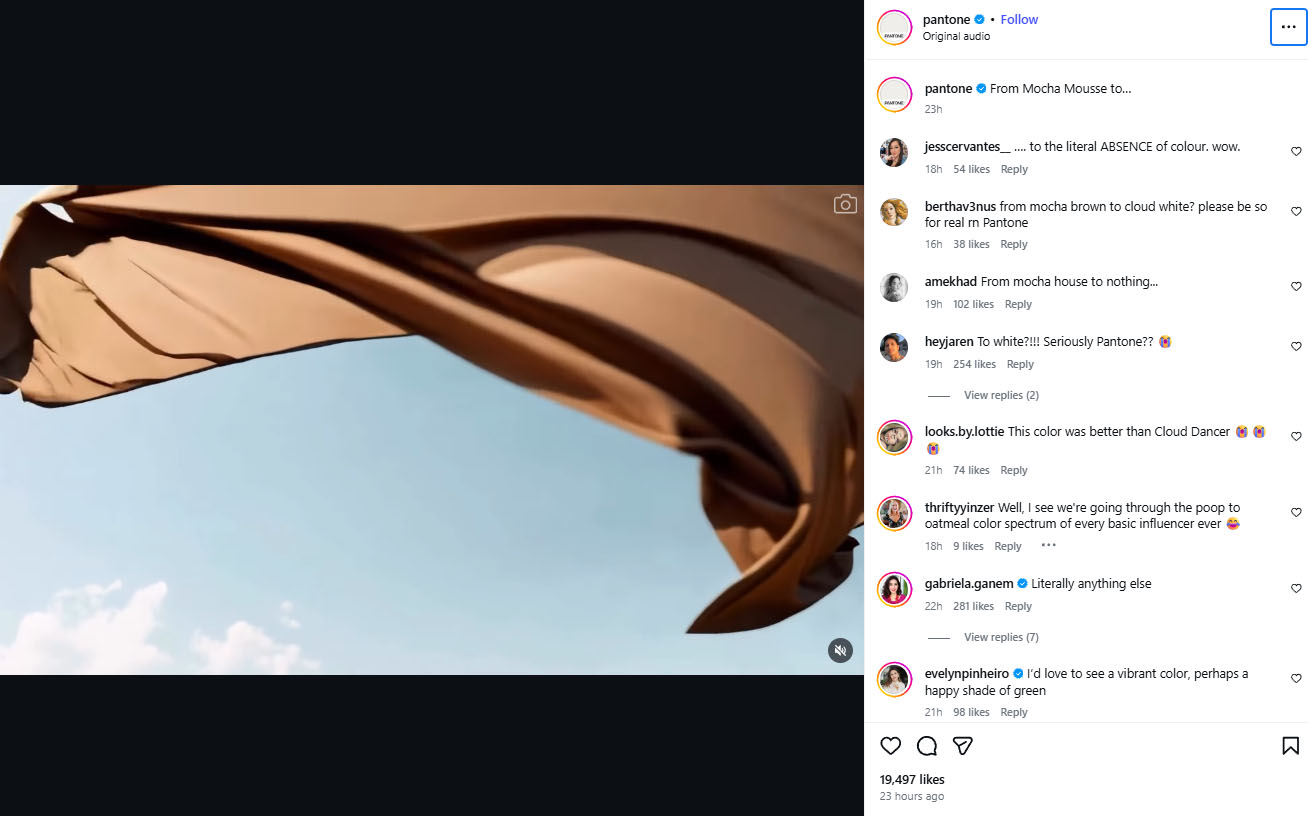
There is a day I look forward to all year, and luckily it always falls on or near my birthday. (There’s a word for that kind of synchronicity and fate… oh yeah, KISMET.) I refer, of course, to the great unveiling of Pantone’s color of the year! Seriously, everyone texted me yesterday when the announcement came out (ok, three people, but still). You’ll recall I even foretold of my bubbling anticipation a few weeks ago when covering one of the several words of the year. At the time, I wrote “We better be getting something jazzier than the previous two year’s subdued hues.” (And yes, I’m quoting myself now, deal with it.) COTY 2024 was “Peach Fuzz,” a shade I believe we all recognized as the color of raw chicken breast, while this year’s reigning color has been “Mocha Mousse.” An improvement over “Peach Fuzz,” for sure, but overall still underwhelming compared to the vibrant choices of years past. Yes, I was pinning a lot of high hopes on this year’s selection. So how do y’all think I’m reacting to COTY 2026: “Cloud Dancer,” aka WHITE?
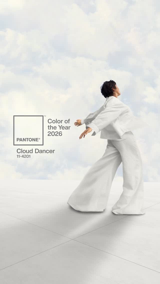
On Thursday, Dec. 4, the global color authority officially named Cloud Dancer (PANTONE 11-4201) as the defining shade of the year to come.
“A lofty white neutral whose aerated presence acts as a whisper of calm and peace in a noisy world. PANTONE 11-4201 Cloud Dancer symbolizes a calming influence in a society rediscovering the value of quiet reflection,” the company wrote on Instagram. “A billowy white imbued with serenity, it invites true relaxation and focus, allowing the mind to wander and creativity to breathe.”
The color, Pantone says, “drifts between light and ethereal, a living calm that invites renewal, vision in serenity and creative release.”
“In a world where color has become synonymous with personal expression, this is a shade that can adapt, harmonize, and create contrast, bringing a feeling of airy lightness to all product applications and environments, whether making a standalone statement or combined with other hues,” they added on their website. “Cloud Dancer gracefully blends into a veiled palette of softened hues that ultimately dissolve into shadowy shades, producing an easy and effortless contrast in color.”
Since 1999, the Pantone Color Institute has selected a hue for its annual Color of the Year announcement. According to an interview with the company’s vice president Laurie Pressman in 2023, the program was intended to “engage the design community and color enthusiasts around the world in a conversation about color.”
Pantone uses a global team of color experts to select each year’s tone. The panel combs through a variety of influences like film and TV production; art, fashion and design trends; new technologies, materials, textures; and even social media or upcoming sporting events.
“Anything and everything taking place in our culture during the year can influence our Pantone Color of the Year selections for the upcoming year and each source carrying a different weight from year to year,” Pressman said. “If you look back to 15 years ago, technology would have played an infinitesimal role. Today that is no longer the case.”
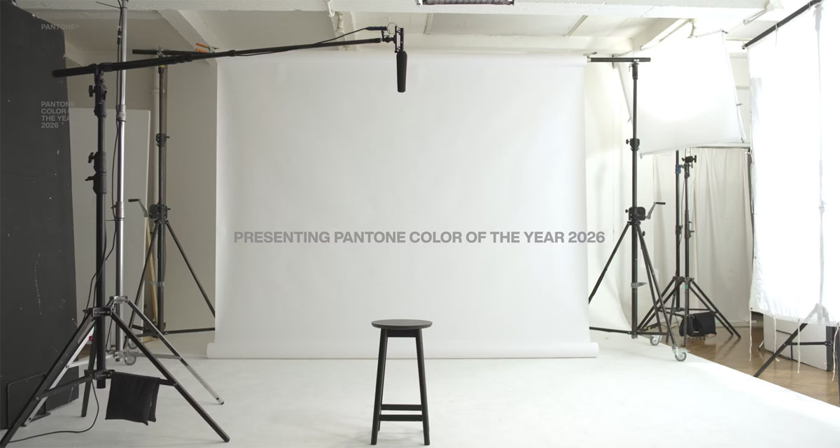
I asked for ONE thing, Pantone! Mix it up and give us a bold color again, for paint’s sake. Give me your radiant orchid, your greenery, your tangerine tango yearning to brighten our lives! But white?? It’s like they’re not even trying. And it’s not a crisp white, either; “Cloud Dancer” has gray notes in it that make for an overall muddled appearance. It’s an inoffensive and thus uninteresting particular shade of white that’s attempting to fade into the background even more than the color does naturally. Pantone has a video celebrating the pick on their website, and the first still is just a blank photoshoot backdrop. Further illustrating that the essence of the color exudes “just waiting for the actual main event to show up.” Pantone also loves touting the brand collaborations they’ve secured to tie into the COTY and, I kid you not, one of the companies is Command — as in the plastic hooks you stick to the wall with removable adhesive tape!! Pantone really dove deep… and delivered dorm room for COTY 2026. So for the third year in a row I sigh and lament, “maybe next year.”


Could that color be anymore boring?🥱 I guess it’s what’s going on in this country everybody must be white and now white is the color of the year.
I’m sure Sidney Sweeney would sign on for a collab.
Random SS comment, her movie Anyone But You was on last night, so I tuned in to see if maybe I missed something about her and Glen Powell’s appeal. But no, I did not.
Aside from the really bad writing – bad as in both poorly crafted and seemingly written from a baseline assumption that self-centered, A-holes are somehow attractive and charming, she was just … there. Like not even Hallmark channel level of acting presence or skill. And the perpetual half open eyes and disinterested/sour expression is apparently not just how she poses for pictures, that’s her primary expression.
@SarahCS – LMFAO. COTD!
“Sydney Sweeney Cloud Dancer Jeans for Spring”.
The jokes write themselves. SarahCS you win all the “snark points” for today.
*tip of the hat*
LOL awesome comment
So white is the color of the year for the 249th year in a row.
Shocker.
I can’t believe that declaration of colors is a thing. I-I just…
I so enjoy your writing Kismet. The color is boring and awful, but your way with words is a delight.
Couldn’t agree more!
Kismet, you need to choosing your own color of the year. The Kismet Color of the Year. I’d be far more interested in that than Pantone’s.
I could not agree more!
Seems perfect for the current political era we are enduring, unfortunately. Even the gray tinge which describes my general mood. I too was hoping for a bright reprieve.
NO.
I had an impromptu group call with a couple of friends the other night and the general consensus was UGH. We’ve decided to postpone sending each others gifts until January as no one is feeling it and then we have something to look forward to (plus we can get all four of us on a call to do the opening).
To summarise, we need cheer and brightness in our lives. This is not it.
I do however echo @Tulipworthy’s comments on Kismet’s writing, you have a wonderful way with words and I really appreciate it.
Well, it seems very appropriate for this timeline unfortunately.
Yeah, especially the gray
The Emperor has new clothes? And the colour of the new clothes is Cloud Dancer
LOL!
F-it! Pantone is officially fired as the color declarer.
This year my color is…FUCHSIA
What’s yours?
On my design wall – raspberry, tarragon, chestnut, lemon, lime, golden honey, copper, peacock, stone, forget-me-not, lilac, pink silk, tangerine.
Seems about white for this fascist hellscape.
Do better, Pantone.
My bedroom is going to be painted mostly peacock soon 😁
Threads is declaring emerald green the color of the year lol.
Bright Teal is my # 1 choice followed by Radiant Orchid # 2.
Blue oak green!
I contend that green is a neutral, and when paired with browns make for an excellent canvas to put whatever other colors you desire. Because when placed on a base of browns and greens, a jumble of colors will stop being a cacophonous mess and coalesce into a woodland meadow full of flowers. And nobody complains about the color palette of a woodland meadow full of flowers…well, nobody anybody ever listens to, at any rate.
Looks like a commercial for Tide – ” Gets the gray out.”
I agree with all of you. Feels intentional in light of the fascism and White Supremacy going on right now.
A lady on Insta posted a video about how colour has been taken out of our lives to depress us, and it’s deliberate and intentional. The posts shows a parking lot decades ago with all these colorful cars and today with nothing but gray black white etc. And the same goes for homes. The poster’s point is that colour activates all these things in us (creativity hope happiness, etc.) and the point of no colour is to deactivate those things. People who are depressed are easier to control.
One of the reasons I love to travel so much (over 20 countries here) is colour. In Thailand, Morocco, Kenya, Maldives, Sri Lanka, Italy, Haiti, Peru, Bora Bora the colours are in stereo. I take so many pictures because I want to continue soaking it long after I have returned home.
My own apartment has a TON of color. There are florals everywhere, greenery, the carpets are colorful, the artwork. It’s why I love being at home. You should see my closet
My colours this year are seafoam, aquamarine, and yellow. The color of the ocean and the sun. Fun fact, hitler hated the color yellow (because of course he did) and he made the people he deemed “undesirable” wear it. It makes me love yellow even more.
MAGA can go pound (white) sand.
Preach
Thank you Mermaid. These times are so challenging. My city in Canada tries to add colour to our lives. In the summer it’s all these pink tulips alongside public streets and in the winter they add so many winter lights and decorations and pops of red. They know winter blues is a real thing and I love that thought and effort goes into helping everyone’s mental health in any way they can.
When I first moved to where I’m current living, i painted my spare room/office a very bright yellow, because I wanted the space to be energizing. The guy at the local paint store cautioned me when I asked for it to be mixed up …. “yellow walls reflect on each other and intensify, so it’s going to be *really* bright yellow”
I loved it – it was a perfect boost especially in the dead of winter.
A few years later, the same guy came to measure for some shades in that room … he was like “I told you …see?” smiling … I smiled back “I love it!” And he was like “you know, that’s really all that matters!”
I repainted it a soothing soft blue a few years ago because I needed less stimulation in that room, but still keep a few pops of yellow in there. Color can be so powerful.
North of Boston, I’m applauding your use of color! I’m trying to do more of that myself. My problem is the overstimulation thing you mentioned. I want a lot of color but too much makes my brain hurt. I have gray walls in my living room right now and I want them gone, but I don’t want a vivid color on the walls because it gets to be too much for me. I was thinking of painting them white, because I have a bright blue couch and a colorful rug and vibrant art on the walls, but this stupid white supremacist move from Pantone has me reconsidering! Grrr!
As someone who had a bright yellow dining room at one point, North of Boston I love this post! yes yes yes! Right now my walls are white because I don’t own here – but I’ve had green kitchens yellow rooms and I have loved them.
I feel you Irving! Right now I compensate for the white walls in my rental by having colour everywhere. A colorful bedspread. Colorful rugs. Faux florals everywhere and real plants mixed in. Artwork that is super colorful and it’s everywhere, so there isn’t much uncovered wall space and what’s there you are more focused on the green furniture etc. When I moved here my 4 year old former neighbor drew me a picture saying she would miss me. It’s on bright paper and she put all her favourite stickers on and drew a unicorn. I got that picture and said I am framing this young lady this fits right in with the whole vibe of my new place. And sure enough I hung it and it totally belongs in this happy space.
@Sideeye- I hadn’t thought of that as a possibility, but it makes a lot of sense. I will say I remember a few years ago, hearing that the tech bros in San Francisco were painting all the beautiful brightly-colored Victorian’s gray! I think it speaks to the current group of wealthy people who are trying to set trends-they have no sense of the world outside themselves. It is sad, but also infuriating that they then impose it on us
Yes Alarmjaguar! Remember the wise lady who said of Elon Musk something along the lines of wherever he moves he is unhappy because there he is and he brings his misery with him wherever he goes. It’s so true. Billionaires (a few exceptions here and there Mackenzie Scott comes to mind) are soulless and miserable. And they impose their malcontent state of mind on the rest of us.
The COTY announcement from Pantone reads like an article in The Onion.
All that breathy blah blah for … white.
I’ll admit that the first thing pat came to my mind when I heard this choice was the rising racism in politics happening in our nation. Even if Pantone didn’t mean it that way, the lack of reflection is extremely disappointing. And honestly, this is so boring (but, as others have pointed out, Kismet’s writing is a delightful antidote to it!)
Ugh is right. I’m sticking my BM Coral Gables living room walls AKA as Pantone 2019 Living Coral.
Et tu, Pantone?
White is not a color–it is ABSENCE of color.
I was really hoping Pantone’s color of the year would be chocolate, I’ve enjoyed the resurgence of brown clothing (thank you, Quince!) after years of not being able to find it. I think it’s an underrated color that’s really flattering on a variety of skin tones and hair shades. *shrugs*
You are absolutely right Kitten white is the absence of colour. I love brown too! My find this winter is a gorgeous brown winter coat. I love it so much! I really need more browns in my closet. Great colour.
So the same week the administration is banning brown and black people from thirteen countries…Pantene announced that white is the color of the year?
I’d say it is the official color of the current administration and of MAGA…
Now I have to avoid white as well as red lol…I have not owned anything red since 2016.
I guess Pantene will be easier to cross off my list than white but will try…
Am so sick of the USA
Wow, I have a totally different experience with color than my fellow bitchies it seems. As I’ve aged, and found life increasingly overstimulating, my preference for color in my home has declined. I went from lime green walls, and cherry red chairs at 30, to creamy white walls and taupe furnishings at 50. I still like color, but I find that I want my home (and wardrobe) to be soothing earthy tones, a haven of under stimulation from the world around me. It’s interesting to hear other experiences, so different from my own
I love it, the Cloud Dancer. It’s a soothing, enveloping hue and I need it in my life. I agree with you that there’s overstimulation and I often feel overwhelmed by it. Our environment is overloaded with colour, image and noise pollution. This colour makes me think of quietness, of gentle wind and smell of ozone. It takes me to my childhood watching the clouds and imagining I was in Neverending Story. Lovely choice at turbulent times, imo.
Did the Trump administration pick the color?
Right? It’s either really bad timing, or Pantone is completely embracing white nationalism. Barf!
I love white tones, in fashion and design. But, to choose white, in the current climate, is depressing.
This doesn’t surprise me. Google the Home Alone house now, I think it was Buzzfeed that had photos? A friend of mine does interior design and has said that almost everyone only wants neutral colors in their house, and the daring ones might want a colorful painting or fun lamp. We are living in a Pottery Barn world. As someone with OCD tendencies with color, the more neutral the better. I’m jealous of those that can enjoy fun colors!